 pseudepigraph
3 years ago
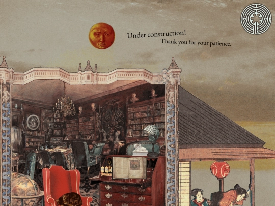
Neocities is having trouble loading stuff at the moment, but if you can see the changes, this is what I meant by yesterday's question. Do you prefer this or how it was before ?
 buzzsawfunds
3 years ago
yeahg neocities was down last night for me too.. its loaded for me now though! i like it!
 buzzsawfunds
3 years ago
i do spot a stray '-->' under your portrait of slava jsyk. besides that tiny thing it looks really neat!!!
 datura
3 years ago
I like it as is but the sorted version might be nice to easily differentiate your original works from fanworks etc
 buzzsawfunds
3 years ago
I agree! I like how it's organized now with the years, but I think having those other categories might be even better
 datura
3 years ago
I really like your art style ♡ I don't know how to explain it but it feels... complete. Like nothing is missing.
 pseudepigraph
3 years ago
Thank you !! Ideally I'd like to change it out every once in a while but there aren't many artists I listen to that are on bandcamp (there aren't many still active / living artists I listen to...)
 pseudepigraph
3 years ago
Though, bandcamp is one of those places where there's always more the more you look, so I'll have a whole gaggle of songs to feature, I'm sure
 capstasher
3 years ago
so long as you dont care about copyright (and you really shouldnt, you're in a remote enough corner of the internet that it doesnt matter), use a yt downlaoder and catbox.moe for file storage to add other songs
 capstasher
3 years ago
back when i only listened to vaporwave and synthwave, it would be incredibly fun to a day going down a musical expedition every now and then on bandcamp
 pseudepigraph
3 years ago
That is true, that's basically how I got Shostakovich's 2nd piano trio onto the myspace page, but consider: that takes effort. (Nah, kidding, I will if I am so inclined to put up a song that'll need me to do that)


![[tfpXE] avatar](/site_screenshots/15/25/tfpxe/index.html.50x50.webp)


![[ Aegi's Cafe ]
avatar](/site_screenshots/40/61/aegi/index.html.50x50.webp)


Thank you so much !!