
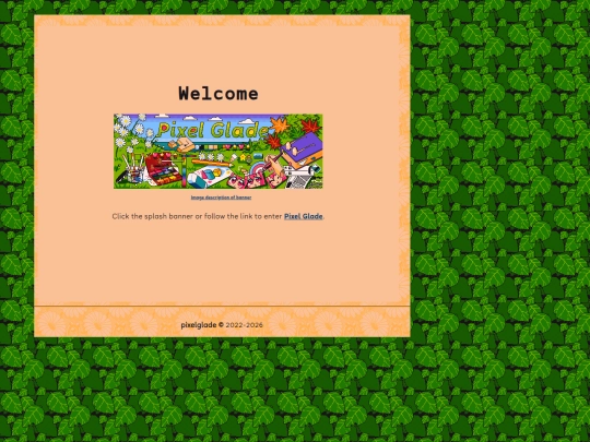
Pixel Glade Splash Page
4,686,006 views
326 followers
3,015 updates
0 tips
I did a vector redraw of one of my Saint Tail manga artworks in Inkscape. I discuss my experience trying to make vector screentones: https://pixelglade.net.au/updatesarchive.html#saint-tail-vector-redraw
3 likes
My homepage comment form got spammed with 200+ comments overnight so I added a validation rule which will just flag the email notifications with (SPAM) if they contain a URL. I'll still check them, but I needed to make it easier for me to quickly check if there were likely SPAM messages.
1 like
Another blog I follow also got a typewriter recently for seemingly similar reasons (as far as I can tell). They didn't use alt text unfortunately but they took a photo of the page they wrote for a blog post: https://jamesg.blog/2025/10/19/growth
3 likes
Added some vegan recipes to the recipe page: https://pixelglade.net.au/updatesarchive.html#vegan-recipe-update-2025-10-18
5 likes
New blog post, a short review of Katawa Shoujo Re-Engineered and its accessibility add-on: https://pixelglade.net.au/blog/posts/2025-10-15-Katawa-Shoujo-Review-Lillys-Route.html
4 likes
Love your artwork! I really like the Digi Charat and Higurashi fanart
3 likes

3 likes
 pixelglade
9 months ago
pixelglade
9 months ago
I remember seeing and looking up Digi charat art because it's so adorable and iconic.


The first post with the typewriter: https://jamesg.blog/2025/10/19/beginnings-type-written
Ooh, thanks for this! You can kind of see the starry-eyed wonder that typewriters invoke. I have so far decided not to post images of my typewriting because it would require both high-res images and lots of alt text. But maybe I will one day with short bits of text.
It might be possible to simplify the process of converting full-length pages of typewriter text to alt text using OCR like tesseract or something else, but even in that case, smaller segments will probably be easier. Personally I'd like to see an example of the text your typewriter produces, out of curiosity for how the letterforms look
My experiments so far with OCR have not worked out well. You'd think it would be easy for a computer to render typewriting into text, but the program I was using actually couldn't parse several of the letters. I will consider uploading some examples of text, though. Thanks for the suggesion!