

[re: pillowfort shut down notice]
really encouraging how every site that sells itself as an alternative ends up having a billion awful issues in it's niche community only to then die for funding related reasons.
i still miss cohost man.
5 likes
trying to jailbreak an old mini ipad to turn it into an ereader really is making me hate apple products more than i already used to do.
5 likes



2 likes
 maehat
2 weeks ago
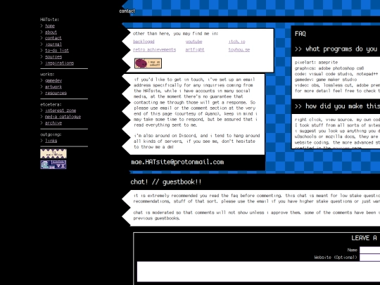
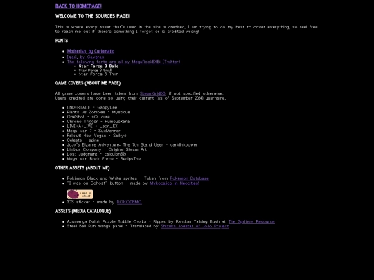
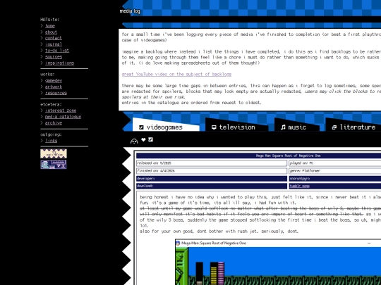
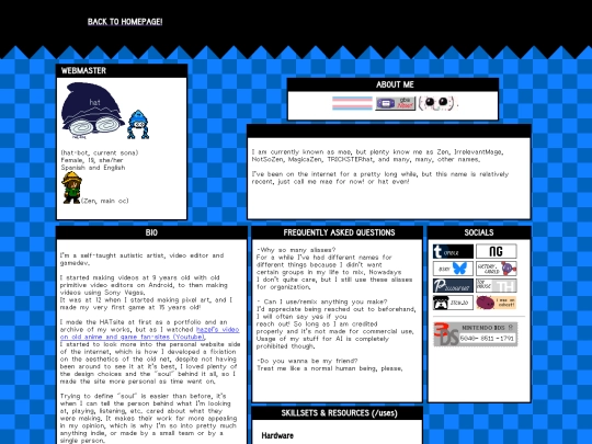
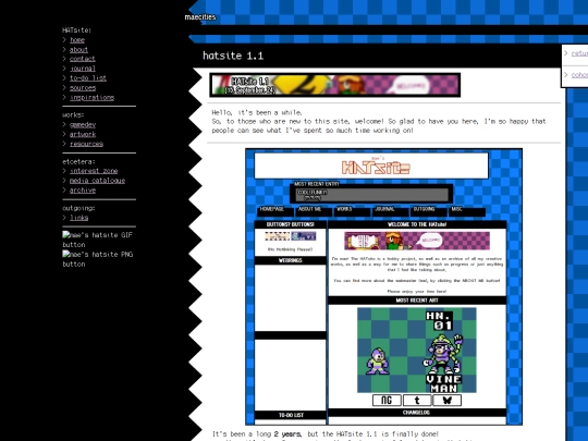
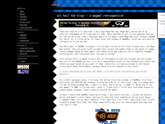
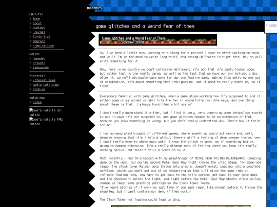
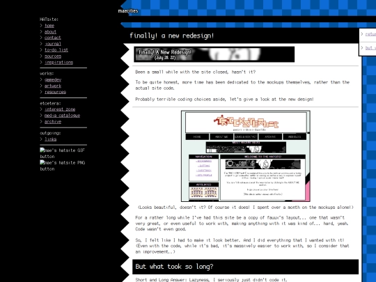
done some small changes to the text of most of the pages. updated the ABOUT ME page to include more userbars and media essentials, as well as adding a list of nicknames i have used. also updated the MEDIALOG, expanded the TO-DO list, added more socials to the CONTACT page. done some small alterations to the site's css as well.
1 like
maehat
2 weeks ago
not mentioned in the changelog but the about me page said that the laptop i broke was an ASUS one and not an Acer , boy i sure hope someone got fired for that blunder - <- got fired from the hatsite and now its managed by a fish -
1 like



4 likes
maehat
1 month ago
done a rough attempt at making the site a little better on mobile devices, desktop users won't really notice any meaningful differences. stuff isn't working 100%, ill find a fix for it when i have time.
maehat
1 month ago
doing this has made me think about how far i could get from rebuilding the entire site using flexbox, i don't have the time for that either however.
looking for tips to make the site a little more mobile friendly.
i have considered making entirely separate mobile layouts on pages of their own, although that could prove to be an issue with how comments work on the site. the site wasnt built for mobile usage after all but id like to remedy any issues that come from it.
2 likes
 aznet
1 month ago
Set your side bar to be collapsible and arrange your divs to be on their own layer. That should let your existing layout work fine on mobile. The only issue is the side by side divs.
1 like
 pixelglade
1 month ago
Flexbox is helpful for dealing with the sidebar as aznet said. My site has a sidebar and it basically will become a row on mobile to go across the top whereas on desktop it is a side bar. I wouldn't make separate pages for the mobile layout because it will cause more work for you, better to take the time to make the original site mobile-friendly.
2 likes
2 likes
considering doing a small namechange to 'maecom' - as in famicom -, any thoughts? site url won't change regardless of whether i go ahead with the change or not.
3 likes

1 like
It's SAGE 2026 right now! I'll be trying to write down a JOURNAL ENTRY about the games I play over there... there's a lot of games to play so by the time I'm done the event is gonna be over :V
1 like


about time i made the SAGE 2026 entry.