
mavoruni,
zus-wurld,
teamobear,
geezlouise,
inkfromasquid,
trillian-amelie,
syncopation,
sepehrjast,
irisnebulaintheclock,
rememberthewall,
cheer4fear,
belle-rowan,
pixeelbb2,
etherealspacejelly,
dopeyuricannibals,
orvell-j-h,
theviolinguild,
midnight-run,
lambyrinthia,
hideout16,
jumart,
pata,
70khz,
isaacvsjacob,
z1172413749,
canelastudios,
ammarker
One week left to enter the favicontest for a chance to have your username and website indefinitely etched as a winner on the forum.. xD
6 likes
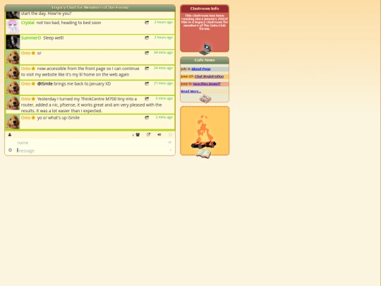


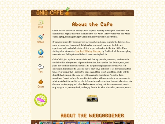
I am running a favicon contest (favicontest) for the forum :) All forum members are invited to join, voting will begin September 24th, and the winner gets their name + website next to a pixel art trophy displayed on a separate contest page in the forum navbar. Winners decided by popular vote. Some more info here: https://forum.onio.club/viewtopic.php?p=1100
9 likes
Can you guys rate my website, i'm still new to this coding thing, pls help.
hej onio! mei ma gur jani-éus! https://a9scorner.neocities.org/gulijani.pdf he pdf usé Gulijani. in the pdf, all e's without the ' (é) are just typos. check it out if you like langs similar to toki pona :))))
1 like
Congrats on 2 mil!! Amazing project, well deserved
8 likes

2 likes

14 likes

2 likes


<3 Thank you!!!