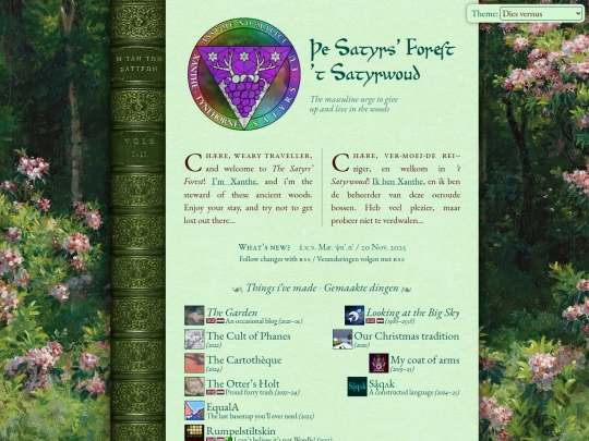
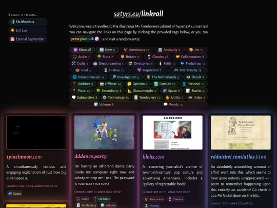
The Satyrs’ Forest 🍇
634,898 views
515 followers
20,103 updates
0 tips
6 likes
3 likes
4 likes
4 likes
THE GARDEN IS NOW OPEN FOR BUSINESS
3 likes
1 like
2 likes
5 likes


Hi-- this is Maya from maya.land! I don't log in here a ton but I wanted to let you know that if you do end up wanting to use webmentions, there is a way for people without webmentions to still leave a comment. It's not super sleek, but if you want to try it out I have a link now at the bottom of my posts: https://maya.land/responses/2020/07/01/test-test.html