
The actual technical analysis of the CrowdStrike thing. tldr: Their testing didn't fully mimic production, they didn't test each individual parameter, just threw in a wildcard, so their automated tests didn't catch a "memory out-of-bounds" error way out in the 21st input parameter. https://www.crowdstrike.com/wp-content/uploads/2024/08/Channel-File-291-Incident-Root-Cause-Analysis-08.06.2024.pdf
3 likes
8 likes
 cidoku
2 years ago
cidoku
2 years ago
I believe this applies to everything digital right now. At the risk of sounding elitist (I'l definitely sound elitist), maybe things are like this: More accessibility = easier to make = less effort = less personal expense = less soul.
4 likes
cidoku
2 years ago
There's a reason old pieces of art inspire awe; once you realize just how much effort they must have taken (and here I'm just repeating what your entry says), it's incredible that they could have been made at all
4 likes
Regarding your comment I accidentally deleted, my font used to be a standard Courier font stack (Courier New, or Courier, or fallback to generic monospace), but I made the jump to a "web font" with an updated version, Courier Prime as you noted. It's cleaner, modernized and in TrueType format.
2 likes
3 likes
 misterdizzy
2 years ago
misterdizzy
2 years ago
You know, maybe I'm not cut out for short surreal fiction. I should maybe stay in my lane and let NoHappyNonsense handle that.
1 like
it's still too easy to delete comments on posts 🤬😡🤬
5 likes

3 likes
 dc-blog
2 years ago
dc-blog
2 years ago
There was just a "Are you sure you want to delete this comment?" popup not long ago so wtf. First 10 comment limit, now they undid the thing to make it hard to accidentally delete comments? GAAAAAAAAAAAAAAAAAAAAAAAAAAAAAAAAAAAAAAY
2 likes
1 like
8 likes
misterdizzy
2 years ago
Font used to be Courier New, now it's Courier Prime. Slightly cleaner modern version.

1 like
I really dig the use of border-radius in your design. Really solid personal "brand" aesthetic.
5 likes
 arandomsite
2 years ago
arandomsite
2 years ago
thank you so much! I really do go for a unique style as I'm not the most creative person lol
5 likes
misterdizzy
2 years ago
I've been through a corporate rebranding as a pro web dev & there's usually a focus on specific consistent details like your use of specific border radius combinations to establish a visual identity (which is then used across websites and emails and so forth). That's a solid development/design technique. :)
4 likes
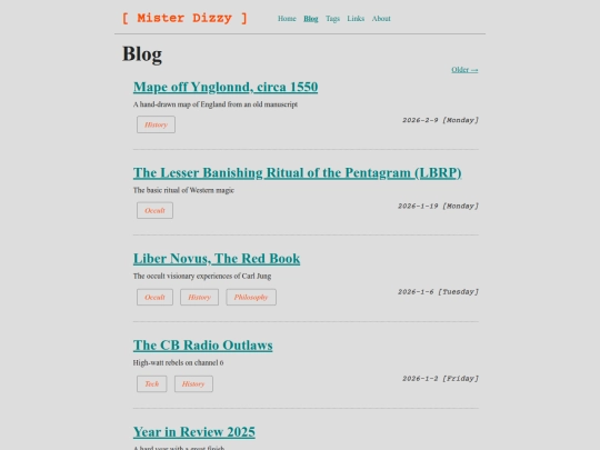
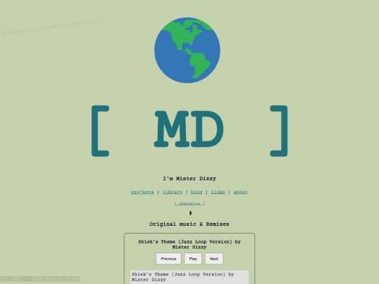
I need serious feedback. Should I change my color palette to look like this? https://misterdizzy.neocities.org/front.png | https://misterdizzy.neocities.org/proj.png
3 likes
3 likes
3 likes
 mr-pibbs-site
2 years ago
mr-pibbs-site
2 years ago
i'm split on the font, always a fan of monospaced but a simple one like in the pictures is agreeable
3 likes
 graybox
2 years ago
graybox
2 years ago
i definitely prefer the blue, although the new font gives off "unfinished" vibes imo
1 like
1 like

1 like


![[tfpXE] avatar](/site_screenshots/15/25/tfpxe/index.html.50x50.webp)


![ELITE784[dot]Online - Redirecting... avatar](/site_screenshots/23/04/elite784/index.html.50x50.webp)


Prepare for a RIVETING, EDGE-OF-YOUR-SEAT technical analysis read.