>_> color me perplexed. I wonder if viewing this on a CRT can speak to why some of these choices were made in 1997? i enjoyed playing around with some different background values here. And, you aren't alone: the first one ff0000 makes my eyes bleed too
very interesting. idk if its a problem with me or my monitor but bright yellow, bright green, and very bright bluegreen are all awful to look at on a gray background, they're so saturated and bright that it's somewhat hard to make out the letters. for sure worse than light brown which i can read pretty easily

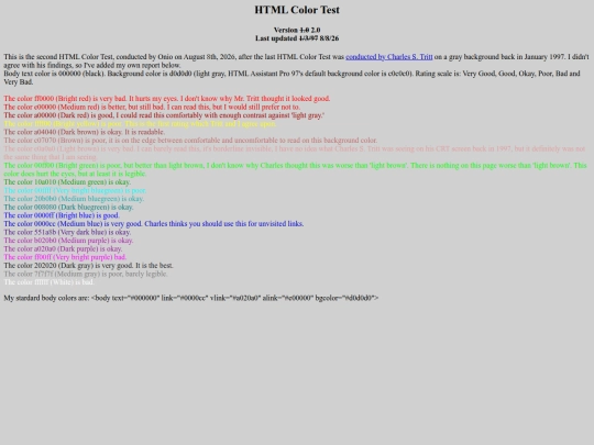


>_> color me perplexed. I wonder if viewing this on a CRT can speak to why some of these choices were made in 1997? i enjoyed playing around with some different background values here. And, you aren't alone: the first one ff0000 makes my eyes bleed too
O_o ..... is what my eyes look like after reading through those lines
ff0000 (Bright red) is good/okay on my monitor!
very interesting. idk if its a problem with me or my monitor but bright yellow, bright green, and very bright bluegreen are all awful to look at on a gray background, they're so saturated and bright that it's somewhat hard to make out the letters. for sure worse than light brown which i can read pretty easily