
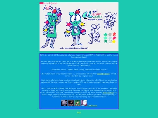
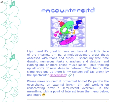
there's something out there | encountersltd
851,365 views
532 followers
3,855 updates
0 tips
I'd like to invest in a vowel
7 likes

3 likes

2 likes
here's a joke - what do you call it when someone's facial hair feels sore
8 likes
14 likes
why is it that sometimes it's harder to muster up the motivation to draw something when you want to draw it?
8 likes

3 likes
7 likes
4 likes

1 like
4 likes
 encounters-ltd
1 month ago
encounters-ltd
1 month ago
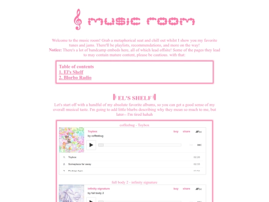
a buncha small additions and changes here and there! i tried to get the music room be like those buttons that open up into paragraphs (to maybe make it less load-intensive at once) but i couldn't hack it ;_; but i added a couple shelf albums and FINALLY added the little blurbs of praise ^^
4 likes
encounters-ltd
1 month ago
I also have a new "characters" listing at the favorites section in my about page! also TECHNICALLY a music section but it's just a link to the music room LOLOL
4 likes
i refrained from listing any music in my about page's favorites section on the grounds it would be redundant given i have a fave music page, but if i did netbooks.WRLD definitely would be on there
4 likes
so how has your day been?
4 likes
 tabf5
1 month ago
tabf5
1 month ago
pretty good! missed having my Neocities feed to constantly stare at this morning, but good to have it back this evening now. also the new KOAN Sound EP is gorgeous
2 likes
 mugmanfr
1 month ago
mugmanfr
1 month ago
NGL, I was worried about my website too, even if I wasn't too active on This website as I was 5 years ago
i know we've had outages before on here but this one was quite a scare @.@ just downloaded a backup of my website, to be careful. unsure where to put the backup, but much as i like it here i'm thinking i should probably mirror the site as a plan B in case of any similar DNS mishaps
5 likes


![auberylis [dot] moe avatar](/site_screenshots/34/10/astrossoundhell/index.html.50x50.webp)


little maintenance update because i levelled up ^.^ (also rewatched monsters inc and decided i can call it one of my favorite movies ehe)
WOAH NO WAY ARE WE BDAY TWINS... HAPPY BDAY EITHER WAY !!
just about! hee hee, thank you!!