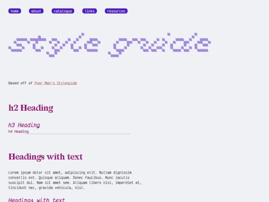
new blog post on the woes of wanting to nuke my website's stylesheet again https://10kph.neocities.org/blog/the-woes-of-design/
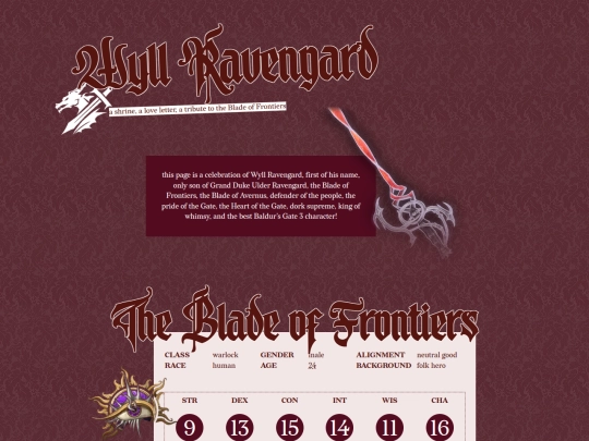
i dont think i could limit my site to the same style for all my pages ^^; one of my favorite things about making new pages is designing them!! sometimes i lack an interesting idea for a page but then ill just make it simple and easy. good luck finding something that works for you!! have fun with your shrines >:3
@solaria thank you!! i like having a consistent style but it's also fun looking at other sites like yours and find different styles and layouts in each page 🤔 shrines are so fun to make though so i think i'll stick with that for now! <3
super interesting stuff! I also agree - I've rebooted mine several times and while I love uniform page design it is not something I can commit to. I really like the idea of a style portfolio for the small web, and It is inspiring me to maybe craft a page with my favroties
Interesting to read your blog post :) I don't have the same problem at all; the most "out there" deviation from my typical pages are my pages where I have a three column grid for images, that's it lol. I think shrines would be a good & fun way to branch out into design. Consistency is nice, but I think if you were to only design what you want to design, it would become consistent by virtue of being yours, a
reflection of you. I think of it like an artstyle; an artist can use as many different mediums as they want, but in the end, their art is theirs. Things like a consistent style come naturally when you don't try to force it. Maybe it's cliche, but just be yourself & everything will fall into place!
I've found the Internet Archive has a few books of late 1990s web design. Sometimes the websites are corporate but they're with a simple HTML/CSS static page design that just doesn't seem as prominent today. I found a lot of the questions I have about web design has been answered through books, not websites, because most web search results for me come up with Top Tens or Web Design Practices You Should Know.
But also I don't think you should have to stick to a single style. The most interesting examples have a mix of influences. Even one of my graphic design instructors said it's about remixing.
I really like this book for examples of late 1990s design. https://archive.org/details/homepagesplashpa0000dani/
fwiw, i think your site is very well-designed and visually appealing/uncluttered! i like it a lot. i also think shrines are a good compromise, it's (theoretically) how i've been trying to deal with the desire to nuke it all and start over, too. good luck whatever you decide on!
i didn't expect much feedback on this post, thanks everyone for the kind words ;___; i really like the idea of a website's design being more like an art style (or a mix of influences/styles) than a strictly consistent thing... i will reflect more on that 🙏🏼
I understand how you feel completely as I've also felt the urge to redesign my site - ironically, from multiple columns to a single column layout! FWIW I have always really liked the design of your site. It's clean but the pops of colour and cute monospace font add personality and make it seem more personal and less formal, somehow? In a way that I like. Shrines are definitely a good way to play with layouts!
hey, great read, I totally get where you're coming from. I love your current design and colour pallete, its nice and easy to read. Your footnotes are great, I often find myself thinking similar. It is definitely impossible to search for this type of inspiration, you have to stumble upon it some other way.
I often find myself going through the Wayback Machine looking at 2000s era websites, the ones with heavy graphic elements, blends, smudges etc and thinking about how I can incoprate something like that within todays modern standards. Let's see what I can come up with...
I, too, understand the urge to wipe out your whole website and start over.
I'd really like to watch The Handmaiden. Knowing that it's one of your favorites, I'll try to watch it this weekend.
thank u for following back <33 i love your site a lot! for notes, i'm currently using the inline (originally for narrow screens) version of Tufte CSS with added hover functionalities & some accessibility improvements, which is far from perfect but will have to stay until i come up with something better…
the blog is back babyyyyy! some of the old posts didn't make it (twas cringe lol)
also new blog post or something. for the 11ty enthusiasts (who probably already knew about this but ANYWAY) https://10kph.neocities.org/blog/global-data-11ty/
removed thin scrollbar for accessibility and added furigana over kanji text (aka, i am having fun with 11ty shortcodes)
Updated
thank you ! <3