 tsylatac
1 year ago
Guild Wars mentioned 👀 I haven't played in some time and never got into GW2, but the original games will always be special to me - battle-inappropriate dress and all, lol. If it's your first time: You'll have bags and banking soon :) bank storage is account-wide, and few items are character-locked, so on the off chance you *do* throw away something irreplaceable... you can make another character and replace it :p
 new-stripes
1 year ago
Doing a weekly roundup is a nice way of organising all your interests! They are interesting to read too.
 divergentrays
1 year ago
@new-stripes - thanks for the kind words! I committed to a weekly post thinking that would get me in the habit of blogging consistently and I think my plan might have worked!
 divergentrays
1 year ago
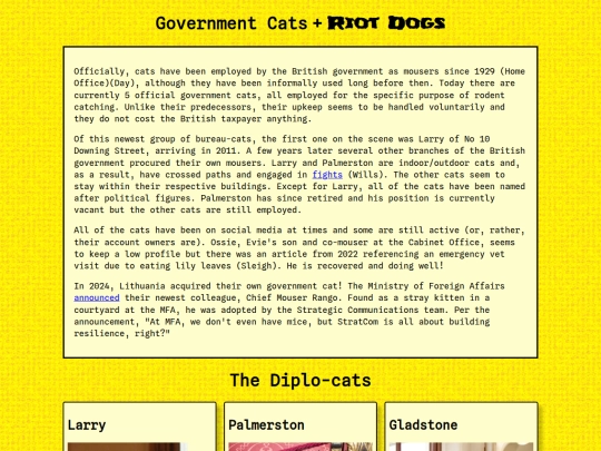
I made this page for the 32-bit Cafe's 1st Code Jam. I was delighted this morning to find out that Lithuania is getting into the government cat game! I've made a card for Rango, the new Chief Mouser. (Who is currently as big as a mouse but ... one day!)
 bright-eyes
1 year ago
Larry is a legend, having been out lasted every Tory Prime Minister since 2011, and still going strong.




![NOT NOW, MOTHER!! [enter shywell] avatar](/site_screenshots/16/97/shywell/index.html.50x50.webp)


What a fun and unique topic for the code jam, I learned some new things!