Saw your post about downloading from youtube! I use a command line app called youtube-dl https://github.com/ytdl-org/youtube-dl
2 likes
3 likes
I like your tamagotchi page! I had up to four at one point, but only my Chibi now: https://bmh.neocities.org/tamagotchi
 faiyubu
4 years ago
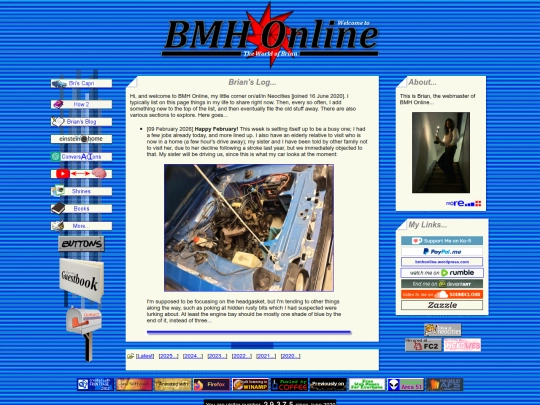
i'm glad you like it! your page looks great, i love how organized it is with the timeline and everything. I was planning to add a journal to mine too, but I got lazy haha, maybe someday... also, what a cute chibi!
 bmh
4 years ago
Thanks! It was a lot of work but it's nice to look back on. I miss some of my Friends!
1 like
3 likes



![[The Wireless] avatar](/site_screenshots/28/98/thewireless/index.html.50x50.webp)


Thank you! I'll look into it and thank you for following back.
add this as another vote for youtube-dl
youtube dl for the win. ive used the gui version, tooo. sometimes ot works on one and not the other so its good to have both