
just found out what my site looks like on different size screens might go bash my head into a rock later
21 likes
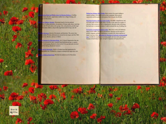
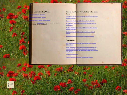
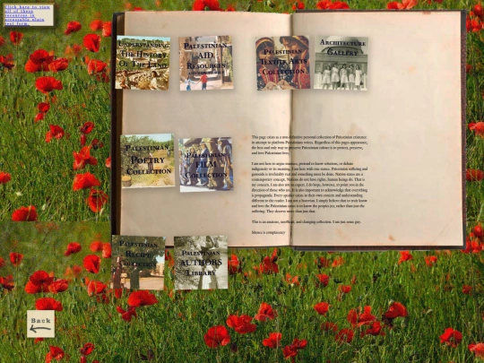
TWO yeah thats right TWO new shelf items uppppppp the second is a huuuge collection curated around palestine, palestinian aid, advocasy, history, and love for palestinian artists. this one *is* under construction still and will remain a livning and working document.
13 likes
 myrrh
9 months ago
myrrh
9 months ago
this one *does* have a plain text verion. which i did start with actually but the feel of a highly visual website and then this page suddenly being plain text came across as a little.. odd. haha. but it does have a plain text verion.
2 likes
NEW SHELF ITEM ALLLEEERRRRTTTTT lol. theres a new item to click on on the main page ! its a photo collection but not like artsy photos just straight up normal regular photos of just shit i see. AND GUESS WHAT. ANOTHER ITEM WILL BE added to the shelf tomorrow or monday or tuesday becasue im on a freaking roll. AND ALSO!!!!!! something new for the library and then also im going to start actually filling out the gallery
14 likes
myrrh
9 months ago
for the tru fans.... theres a pic of a crumpled up thing on the floor in the 2022 album, thats actually the backdrop from the photo that is beyonces renaisance album cover i almost stole but thought someone would hunt me down so i didnt lol
2 likes
myrrh
9 months ago
also ive come to realize that its not always clear that the exit signs in the upper left corners are back buttons ......
1 like
2 likes
2 likes

hey ! my work made it into the Nintendo direct ! neat !!!!!
16 likes

omg omg ur site reminded me to watch over the garden wall asap. there's so many good things to watch this fall so i forgot
1 like
3 likes
2 likes
420 followers.....lol
14 likes


your site is so sickk, dig the vibe heavy
1 like
2 likes
1 like


![[ARCHIVE] cresentri.com avatar](/site_screenshots/33/74/cresentri/index.html.50x50.webp)


cursed knowledge, something no one should know about their site imo
I was going to say the solution is grids and queries, but then I checked. It looks like your already using both of those. Sorry. ¯\_(ツ)_/¯
For the record I feel most of the best webmasters (and mistresses) feel the same way. I know I do. After working on my pages for hours on end, none of them look good anymore. Always something to change, always somethign that isn't good enough.
I like that your site is responsive though. Mine wasn't until I found out one of my friends dosen't hae a computer. She hasn't owned one in 6 years. I really wanted to share my site with her and after months of running it, went back and redid my entire site from the ground up so it would look good on her Iphone (and other phones of course too), and I'm so thankful I did.