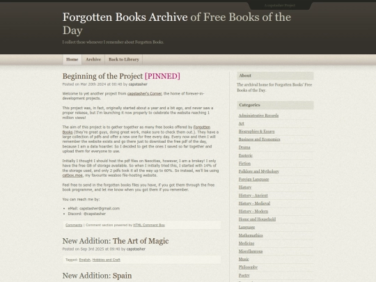
@moheb-rofail while i really like the design of the Archive, and i chose it because it sticks with my theme so well, its just a generic free mid-2000s template I found online. My main pages, while more janky and duct taped in place, have been modified extensively to fit the vibe i wanted the site to have.
A new theme, that will suit the site even better, will eventually be crafted. And that I plan to make from scratch after some intense html css and js learning. But for now, I think the original capstasher's Corner is good enough


![[tfpXE] avatar](/site_screenshots/15/25/tfpxe/index.html.50x50.webp)


![An Expansive Link Directory Of We The Peoples Internet [Learn, Explore, Communicate] avatar](/site_screenshots/29/21/stonedaimuser/index.html.50x50.webp)


That is the great design your whole site should follow, well done.
@moheb-rofail no way, hard disagree! it's good for the archive, but the rest of cap's site's just fine
@moheb-rofail while i really like the design of the Archive, and i chose it because it sticks with my theme so well, its just a generic free mid-2000s template I found online. My main pages, while more janky and duct taped in place, have been modified extensively to fit the vibe i wanted the site to have.
A new theme, that will suit the site even better, will eventually be crafted. And that I plan to make from scratch after some intense html css and js learning. But for now, I think the original capstasher's Corner is good enough