Virtually Isolated
virtually-isolated.neocities.org
240,194 views
337 followers
6,952 updates
0 tips
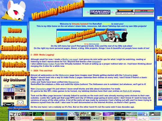
Thanks for looking at my little site! I love the black and green vibe with the ASCII and your art on the main page! Cool and fun resources & tools, too! Can't wait to see more!
6 likes
Absolutely amazing website! I love your gallery and all the various styles for all the sections of the site!
6 likes
I love the digital keyboard!
4 likes
2 likes
15 likes
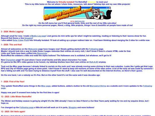
Okay, slightly better Halloween Update! I really need to sort out my style sheet because it doesn't actually take on over half the pages. Later.
17 likes
5 likes
4 likes
2 likes
1 like
22 likes
 virtually-isolated
7 months ago
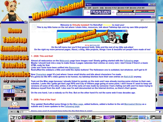
whew, just in time for Halloween! I've made a little mess of the site but you will always be able to go to the Win98 theme once the laugh wears off!
7 likes
2 likes
2 likes
1 like
How rude of me! In my head I replied and thanked you for looking at my little pages, but I never actually did! I'm sorry! I like what you got and I can't wait to see your site grow and grow over time!
4 likes
Thanks for looking at my little site! I love the Polish Pokemon name list! Always fun to see how the writers creatively changed some of the name to fit in other languages. I love the different themes you have, too! The Mena one is my favorite!
3 likes
 cezram
7 months ago
Thank you! The Mena theme was actually broken because a JavaScript file was missing, but I've uploaded that file just now! (The uploader initially rejected it because of...an empty line at the start 😔)
2 likes
15 likes
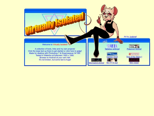
Love the site and sona as well, she's hella cute ^^
1 like
1 like
 virtually-isolated
7 months ago
Thank you! I love the style of your gallery and your screenshots & edits! Good ol' Gmod!
1 like






![[tfpXE] avatar](/site_screenshots/15/25/tfpxe/index.html.50x50.webp)


![.:.[heather saturnia].:. avatar](/site_screenshots/11/46/heathersaturnia/index.html.50x50.webp)


![auberylis [dot] moe avatar](/site_screenshots/34/10/astrossoundhell/index.html.50x50.webp)


![[tofokyo.com] avatar](/site_screenshots/18/56/tofokyo/index.html.50x50.webp)


![[N6] avatar](/site_screenshots/22/24/blankbarrel/index.html.50x50.webp)


of course!! thank you :-) <3