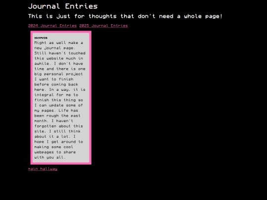
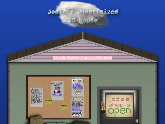
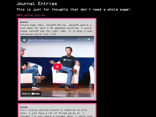
This is so incredible, the animations that happen when you hover are awesome omggg
1 like
1 like
2 likes
3 likes
awesome site!
1 like
1 like
 jodieblend
9 months ago
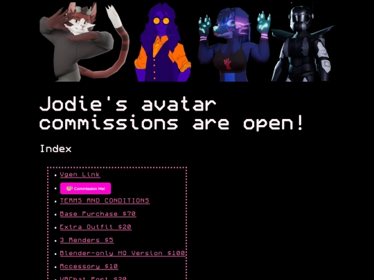
YOUR site is awesome. "why AI is good actually" made me chuckle. Your OCs are awesome btw. ERM looks like an Aibo ERS-110. I've been a bit obssesed with Aibos for the past 7 months.
1 like
1 like
 vv0ltz
9 months ago
I'm also impressed that your site is also functional on mobile. I find image adjustments for mobile hard and you did really good job on that
1 like
 jodieblend
9 months ago
Thank you. Unfortunately a lot of pages which aren't the index don't share the same level of quality / don't have the same mobile support. The index is what I want the rest of the website to look like. I have so many themeing ideas, just no time to execute them.
1 like


![[tofokyo.com] avatar](/site_screenshots/18/56/tofokyo/index.html.50x50.webp)


your site rocks
ty