
I like when I visit a site and instantly think, "wow this person is so cool." The dancing mushrooms are impeccable. And thank you for following me!
1 like
 moonbunny
3 weeks ago
moonbunny
3 weeks ago
thanks so much. i like your field recordings a lot. im excited for your site and more updates. its very nice to meet you.
1 like

wonderful site. very cozy. i like your layout on the pages with your plants. i may use your idea on my site.
1 like
 zizziasaura
4 weeks ago
zizziasaura
4 weeks ago
thank you <3 I really enjoy yours too. I was stoked on your catalog of mushrooms. I am surprised you found an intact strawberry bush they're usually demolished by deer. very cool.
I understand its a bit uncouth to ask here but Im struggling quite a bit financially and am getting a little desperate. If you've enjoyed by blog and mushrooms/plant identification pages I ask you to please consider if possible sending a couple dollars my way as support. I am an unemployed trans woman in the USA South and my hobbies don't necessarily make me a lot of money either. Much appreciated. paypal.me/shloopp
1 like
moonbunny
1 month ago
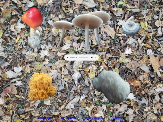
After a couple years of searching I've finally found a chicken of the woods mushroom!
Really cool site! Thanks for the follow, nice to meet you.
1 like

Foraged some tasty edible mushrooms after all the rain we had. Beat Final Fantasy 12. Some life events going on. Maybe a blog update will come soon.
3 likes


![[tfpXE] avatar](/site_screenshots/15/25/tfpxe/index.html.50x50.webp)


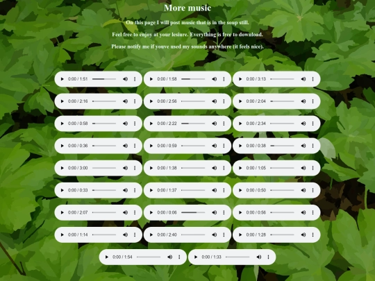
I need to figure out how to code a media player. This is getting ridiculous lol.