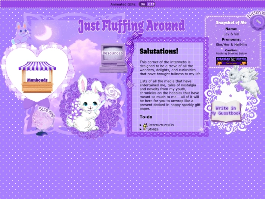
Just Fluffing Around
justfluffingaround.neocities.org
158,817 views
207 followers
4,923 updates
0 tips
Oh my goodness everyone, my new webpage is live! Aaaa! Please go see it, I'm excited to see what you say!
1 like
Long time no see everyone, I'm getting ready to do an entire website over haul of my neocities and the main homepage is *almost* ready to launch. Excited to express myself on the small web again!
1 like
3 likes
1 like
2 likes
1 like
4 likes
3 likes
4 likes
1 like
 justfluffingaround
4 years ago
EEEEE, the new layout for my Blue's Clues page looks so good, I LOVE IT SO MUCH! Thank you CSS grid! Also, the Blue's Clues house is my "back to home" button and I found a Blue's Clues image for my "back to fav fair" button too, just have to edit it!


Welcome back! And I'm excited to see what you've come up with. 😊