
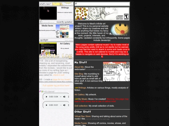
meel's infinite art project
664,948 views
478 followers
20,830 updates
0 tips
2026 is shaping out to be a fantastic year for video games which is great for my consumer self but terrible for my creator self. I’ve been playing pronoun palace for hours on end instead of working on my new webshrine and I just finished a day long session of deltarune…
4 likes

1 like
6 likes
1 like
happy thursday just kidding it’s wednesday happy april fools to all fools of neocities
7 likes
1 like
1 like
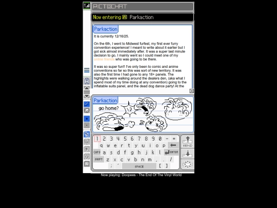
 parkaction
3 months ago
parkaction
3 months ago
@heart143 pretend i said happy wednesday just kidding it’s thursday happy april fools to all fools of neocities
4 likes
 feign
3 months ago
feign
3 months ago
AWESOME AF MEEL THAT SOUNDS FUN AF!!!!! ravefurrest comes around to baltimore often and my boyfriend keeps saying we gotta go lolol
1 like
parkaction
3 months ago
@feign it was a BLAST. you definetly should listen to him and go sometime! just remember to get tickets early so you dont end up paying double the price
Published a short article today about games I played in 2025! https://parkaction.neocities.org/games2025 . Also I'm aware my music page is currently broken, I don't know what happened but it might take a minute for me to fix it
8 likes
hiii i really like ur site!! can i ask where u got that anime girl advertisement that redirected to the "perversion" wikipedia page that u used to have?? i wanna add it to my webpage but i cant find it anywhere!!! T_T
(i used to be basilochre but now that im trans.... starting from scratch...)
1 like
parkaction
4 months ago
oh my gahhh sorry for the late reply!!! I don't remember, i've had it for a long ass time. I still have it saved for future use tho cus I swap out the ads sometimes lol here https://parkaction.neocities.org/sitereasourses/anime3.png
1 like
 tekerare
3 months ago
tekerare
3 months ago
hey, i can pitch in. this ad comes from newgrounds back when their servers were funded using adspace for hentai affiliates. i remember downloading that banner from it LOL
1 like
 covjames
3 months ago
covjames
3 months ago
@tekerare ohh... Im Too young to have experienced Newgrounds to Such a degree...uwaaah..but thank u Anyway!
i am extremely amused by this guestbook message i got today. https://cdn.discordapp.com/attachments/976919459472228392/1471346346559541299/IMG_0466.png?ex=698e9991&is=698d4811&hm=2cca7f01db83912f10b78d7757db0f3be25ff2064ea2a23b16a9a59cd448a969& did anyone else get such a message recently cus at least one other person has haha
4 likes

1 like

1 like

1 like


![b[b[b[b[big lumby]y]y]y]y avatar](/site_screenshots/32/55/biglumby/index.html.50x50.webp)


new blog postststst i went to a cupsleeve event for the first time