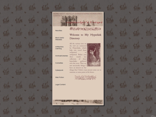
I really like your site. It's very stylish; I always enjoy a limited color palette.
2 likes
flawless design
5 likes
2 likes
9 likes
1 like
 capstasher
2 years ago
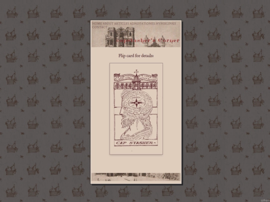
It's a collage with modifications. The beard is added my hand, trying my best to imitate the style they used for the hair. The background comes from the ex-libris of "In and Out of the Garden" by Sara Midda. The main portion is The Astro-Chart from The Book of Life, illustrated by Dr. Alesha Sivartha
3 likes
1 like
1 like




![[tfpXE] avatar](/site_screenshots/15/25/tfpxe/index.html.50x50.webp)


![An Expansive Link Directory Of We The Peoples Internet [Learn, Explore, Communicate] avatar](/site_screenshots/29/21/stonedaimuser/index.html.50x50.webp)


Thank you my friend! I greatly enjoyed your site as well! loved exploring the various flash animations you have. I love that Ruffle keeps this medium alive
@capstasher Hell yeah! I'll add you to my links page later today. Cheers!
@capstasher There. I linked to you.
@cidoku Hey man! Finally got around to adding your button under my mutuals section as well!