
hey, just so you know, if i click on your "about me" and then on the X i get 404'd. :P
1 like
ich sehe auf neocities nicht so oft deutsche hehe but i love ur site's color palette! it's like a crunchy green apple..
i added ur button to my virtual neighborhood :3
1 like
 hypercrites
1 month ago
hypercrites
1 month ago
ohhhh danke :3 love the nostalgic feeling of your site '-' added your button as well. :>
1 like
i so much love transparency with blur but it feels like it does not work well with my style at this point. i tried changing it for the navigation but it felt so out of place, i dunno. <.<
1 like
 chilblands
1 month ago
chilblands
1 month ago
hmm idk what you mean? your button? i think if theres transparency and blur it make text hard to read because your font colour is the same as the bg if that's what you mean
hypercrites
1 month ago
no no, the background of the navigation, not the button themselves. it would look more like this: https://file.garden/ahHWLleoUivvEJyM/screenshits/2026-06-06-001.png
chilblands
1 month ago
ahh i see! that does look really nice, i do prefer that look more. maybe its the border and button placements that's throwing you off? you can use "display: flex; justify-content: space-evenly" to make everything evenly spaced out with margins so buttons look a bit smaller... i like border:outset when it's not activated and border:inset makes everything look 3D. just my opinion!!
phew we are back, is everyone okay? someone need medical aid? ಠಿ_ಠ
7 likes
hypercrites
1 month ago
glad i download everything every day before going offline as a backup so i could at least made some changes and then just upload it later, heh.
2 likes
 nocturnaldiary
1 month ago
nocturnaldiary
1 month ago
I seriously thought my internet was acting up because I couldn't reach my site. That gave me quite a fright. 😭
1 like
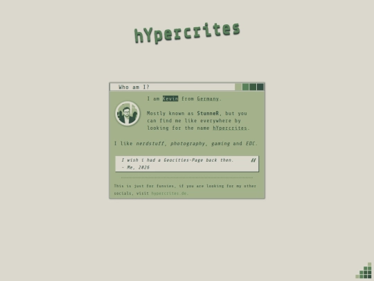
Tyyy so much for the follow! I absolutely love the effect when you click the image, and that shade of green is gorgeous.◝(ᵔᗜᵔ)◜
1 like
hypercrites
1 month ago
oooh thank you too and for adding my button, i added yours too! :3 the blue colorscheme fits perfect for your username, i love it! '-'
1 like
hypercrites
1 month ago
omg i just noticed the cursor, it fits soooo well, isn't it from the Qogir-theme or also Breeze like mine? :O
1 like
nocturnaldiary
1 month ago
Tyy so much! Love your cursor too. This cursor is oxy blue love, I got from the site rw-designer.
1 like
finally fixed the navigation for safari. safari is a mess and i hate it with a passion, right behind chrome and chromium-based browsers. >:(
7 likes
hypercrites
1 month ago
oh and also added a cursor for the thumbnails so its easier to understand that its clickable. :>
3 likes
woah since when did you add my button? i had no idea. :s
added yours too! :O
2 likes
 brittanymarie
1 month ago
brittanymarie
1 month ago
just last night i created my neighborhood section! ty for adding mine in return <3
2 likes
2 likes


![[tfpXE] avatar](/site_screenshots/15/25/tfpxe/index.html.50x50.webp)


![.:.[heather saturnia].:. avatar](/site_screenshots/11/46/heathersaturnia/index.html.50x50.webp)


![olly place :] avatar](/site_screenshots/33/48/ollyjunkyard/index.html.50x50.webp)


It's supposed to be a media log, but I'm still working on it haha. So it just takes you to my Not Found page.