Websites
Search
Activity
Learn
Support Us
Sign up for Free
Sign In
Neocities.org
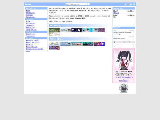
Nebula
nogood-angel.neocities.org
39,684
views
58
followers
4,414
updates
0
tips
Share
New Followers
puddingcat
,
neovampzz
,
clovded
nogood-angel
5 days ago
Should I make a Discord server? (Bad idea)
1 like
nogood-angel
updated their site.
6 days ago
home
2 likes
nogood-angel
updated their site.
1 week ago
medialog
1 like
nogood-angel
updated their site.
2 weeks ago
aboutsite
2 likes
nogood-angel
updated their site.
2 weeks ago
home
1 like
nogood-angel
updated their site.
3 weeks ago
home
index
webmaster
4 likes
nogood-angel
updated their site.
3 weeks ago
home
2 likes
nogood-angel
updated their site.
4 weeks ago
journal
1 like
nogood-angel
updated their site.
1 month ago
aboutsite
webmaster
1 like
nogood-angel
updated their site.
1 month ago
journal
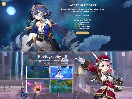
shrines/genshin
contact
home
index
1 like
1
2
3
4
5
6
7
8
9
…
29
30
Website Stats
Last updated
6 days ago
Created
May 11, 2024
Site Traffic Stats
This site follows
Followers
Tags
personal
angel
writing