
Planning to make an artfight archive on the site thatll show every year's attacks and defences with proper links and cred-- think it would be cool to have a neat archive showing everything since ive been doing it every year since 2017's art fight
1 like
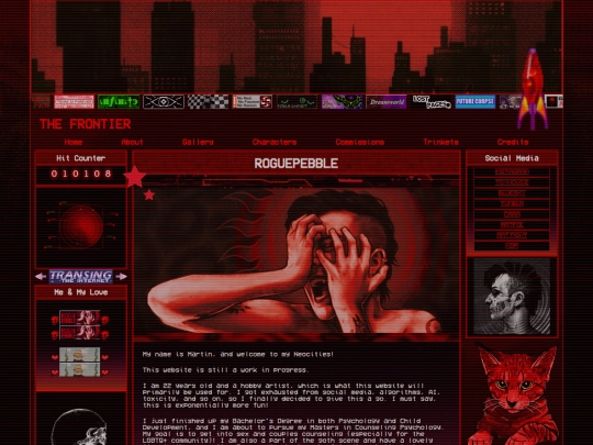
anyone else on artfight here ??? send links is u are! i am gonna have a latter half list and i wanna build it up a bit more :)
3 likes
i need to commit to coding the foundation of the blog part of my site cause I got things on my MIND
1 like


Art Fight is here! I scquared away two drawings which feels insane but hey!! too bad I cant load them up on AF. Ill put them in my gallery tho lol
2 likes
2 likes
1 like


![xX [ TR/BZ ] Xx avatar](/site_screenshots/41/77/toribytez/index.html.50x50.webp)


![[N6] avatar](/site_screenshots/22/24/blankbarrel/index.html.50x50.webp)


Ittl probably be a button through my gallery which I plan to update once artfight is over (code wise) to make it neater and such