
another user of 7.css! I use it for my blog too and I think it looks great. glad to see someone else using it
do u have a button? want to add you to my websites section but I can't find it. might be blind
1 like
 firozah
2 years ago
firozah
2 years ago
omg ty :) i don't yet but i'll post about it when i make one. i want to do a gif one but all the nice button maker resources don't support it so i may have to go old fashioned static
1 like
 soder
2 years ago
soder
2 years ago
if you have a way to grab the individual frames, you could use ezgif.com to compile them into a gif!
1 like
5 likes
 slaid
2 years ago
slaid
2 years ago
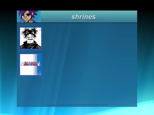
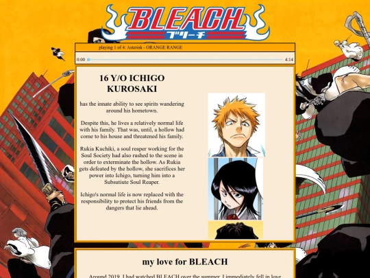
new shrine about my favorite animanga: BLEACH!! Also updating my website page today, just wanted to finish a shrine
1 like
very cool art!! i like the site
1 like

5 likes
slaid
2 years ago
worked on my shrine page and completed my first shrine! I'll update the choso shrine as time goes and the header on the shrines page is placeholder but I'm really happy about how it all turned out
slaid
2 years ago
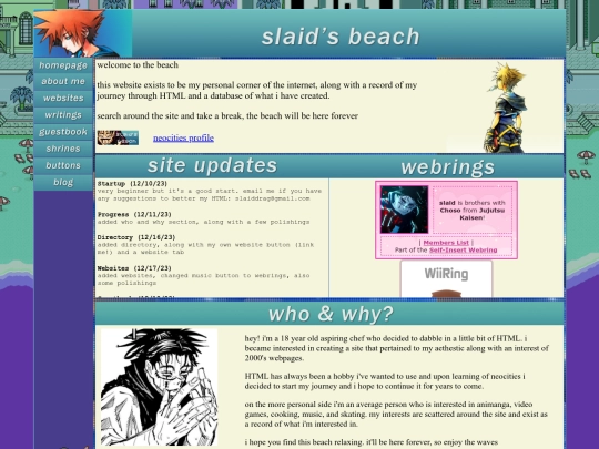
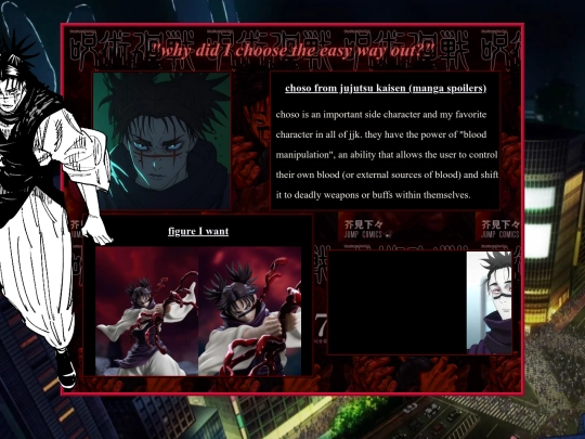
DO tell me if the choso shrine page looks ugly though. I spent like 2 hours on it and honestly I'm not sure how I feel yet
 asterion
2 years ago
asterion
2 years ago
In Firefox browser, the B&W characters look as though they should be more to the left than they are. The B&W character on the left is blocking the main frame (the one in red). I don't have access to Chrome or M$ browsers at the moment.
Does anyone else have a site that feels held together by candy floss. Just tried to do a quick edit and nuked my site. HTML gods save my soul
6 likes

1 like
asterion
2 years ago
If you don't do this already, before you make any edits, save the webpage in question. If you make any edit that significantly alters the site adversely (and you can't remember how to 'back out of it'), you can simply go back to an earlier save.
1 like
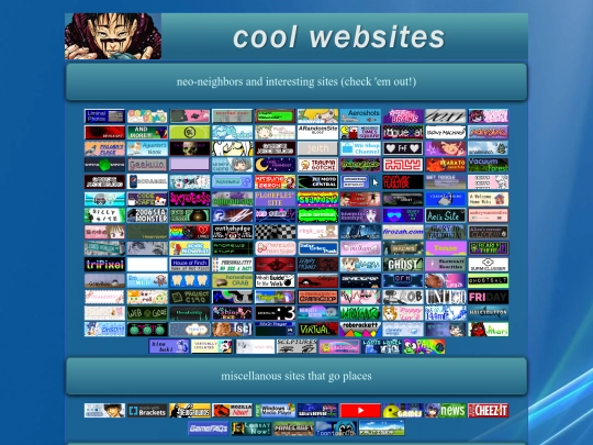
my #1 goal for neocities is to get linked as one of the many people on neonaut's site
6 likes

1 like
1 like

1 like

1 like


![xX [ TR/BZ ] Xx avatar](/site_screenshots/41/77/toribytez/index.html.50x50.webp)


![[tofokyo.com] avatar](/site_screenshots/18/56/tofokyo/index.html.50x50.webp)


caught me at a good time, I just logged back on! added you to my websites page