has anyone else who just started their college realized how way fast college goes. im over here cutting out shapes and on my third quiz of stats already
11 likes
i made an usahana sticker in case anyone's interested... lol https://hunipyon.bigcartel.com/product/rainbow-bunny-joy-and-whimsy-vinyl-sticker
6 likes
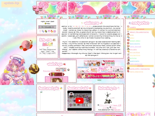
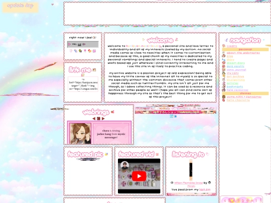
my new homepage is live, but not complete! please look forward to it <3
7 likes
4 likes
1 like
got a little too busy bc i got my vaccines and got sick but hopefully i can finish up some coding this week
6 likes
finished my first full week of school!
14 likes
 hunipyon
1 year ago
expect updates tomorrow, maybe finishing up most of the index page but no promises
8 likes
2 likes





webhosting made by dimden
The webspace for cats
meow :3