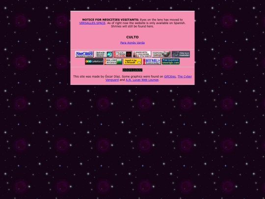
Your index's new layout and background pattern look terrific, but the foreground's #d33f49 clashes hideously with the latter. Mayhap a slightly lighter green, blue or teal hue would mesh.
Likewise, the layouts of the other pages are sprucely attractive, but that white background is so typically hard on the eyes and monitor. Maybe a very faint cream or green background color would produce a more softly palatable appearance.


![auberylis [dot] moe avatar](/site_screenshots/34/10/astrossoundhell/index.html.50x50.webp)


I updated the entire site, you may need to delete your temp archives to see the changes
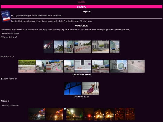
Worked on this the entire month, give me feedback, soon pls
I love the choice of colours and the pattern on the green. It has a nice impact. I like the design of the whole site.
Your index's new layout and background pattern look terrific, but the foreground's #d33f49 clashes hideously with the latter. Mayhap a slightly lighter green, blue or teal hue would mesh.
Likewise, the layouts of the other pages are sprucely attractive, but that white background is so typically hard on the eyes and monitor. Maybe a very faint cream or green background color would produce a more softly palatable appearance.