21 likes
 bondiaries
1 year ago
can you believe ive reused this layout thrice now. i think it will stick this time. also return of snotgirl shrine and finally updated polarisms. all is not lost bon is still posting
1 like
1 like
LOOKING SOOO SO CUTE IM SO EXCITED YAYAYAYY
1 like
1 like
17 likes
 bondiaries
1 year ago
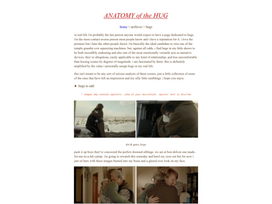
sappy horticulture page ive had in my backlog for a while. it needs to be weirder visually but i havent had time to tinker. enjoy! + hug housecleaning
 podruff
1 year ago
How fun! Loved reading, tho I would love to see a picture of 1 million grasshopper
1 like
 bondiaries
1 year ago
im on it, do not even worry. i have so many 1 million grasshopper pictures i just need to collect them all
2 likes
2 likes
11 likes
2 likes
i hate to break it to everyone but unfortunately ive gotten a bit too involved in a musical. So. review maybe shrine coming for that soon IM NOT DISAPPEARED!!!
8 likes
your site is so so cool!!!!! youve achieved what i wish i could do in balancing aesthetics and accessibility... i love all of it :-)
1 like
1 like
4 likes
1 like
7 likes
 bondiaries
1 year ago
NEW SPLASH i like it a lot better than the old one. more arctic-y. someday ill draw something for it but for now this is cute ^_^
9 likes


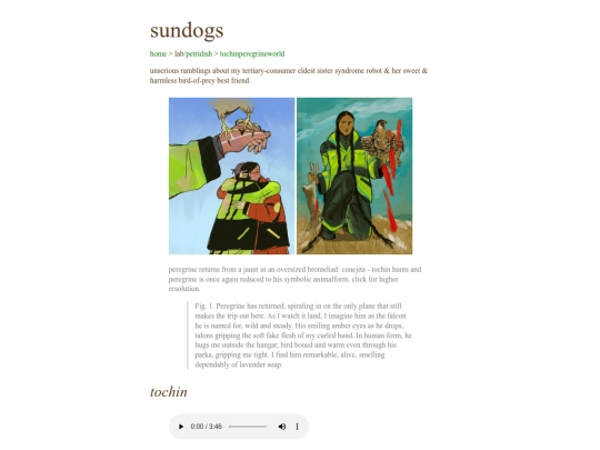
sundogs page for my freakies ive been painting them a lot they need a place to go. tidepools is old but will be updated soon :3c
AHHHH I LOVE THEM !!! so so cool.