 gaily-novelry
2 years ago
Had to fix some links that we fucked up. In good news, we have shiny new updated covers! Later, we're going to work on downsizing some images so that they load better, I think.
 gaily-novelry
2 years ago
Some of the novel imgs are going to be missing for a hot minute; we have to go do something, but we'll fix the links as soon as we can! Made a mess of things because we made a hundred versions of every cover while figuring out the optimal file size and type, oops. Going to replace everything with jpgs of the right size.
 gaily-novelry
2 years ago
Missing imgs should be restored! Going to slowly chip away at replacing the other images on the site. <3
 solaria
2 years ago
I personally think they do hinder the readability since they (for me) visually detatch the first letter of a word from that word. but as long as its not like every paragraph i think it should be fine! ^^ it just might take a second longer to read

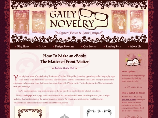
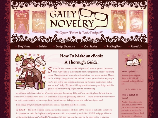
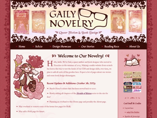
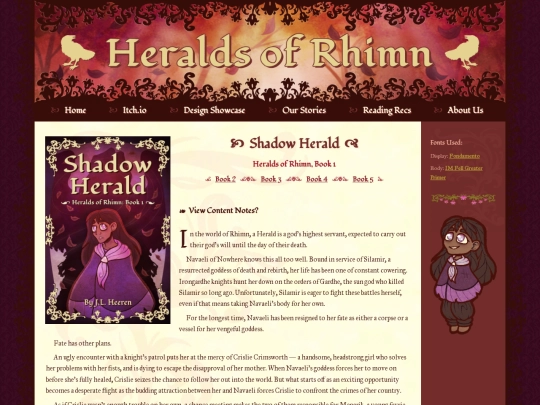
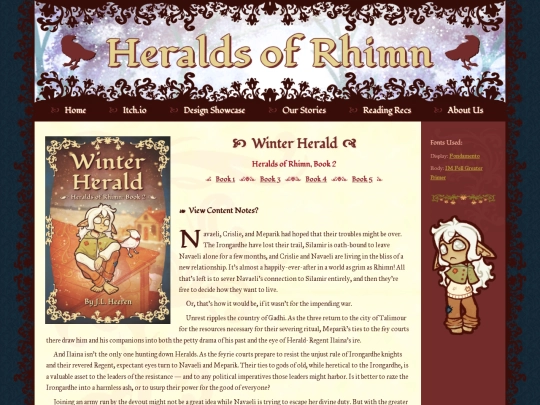
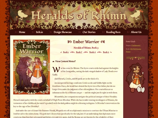
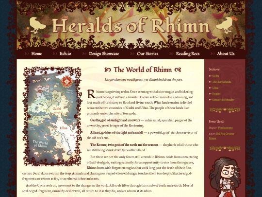

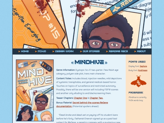
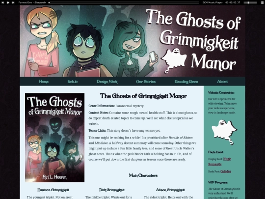
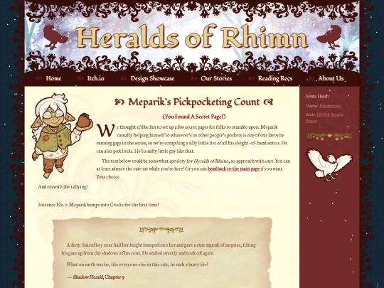
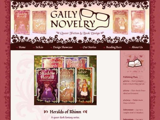

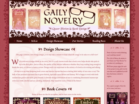
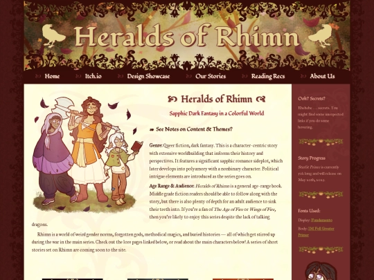

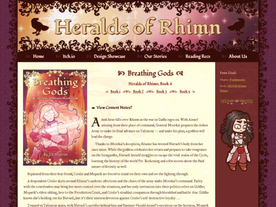


First three book's pages should be cleaned up all nice! The Itch.io PDFs and EPUBs will be updated to match the site samples tomorrow. <3