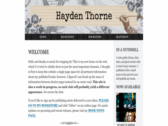
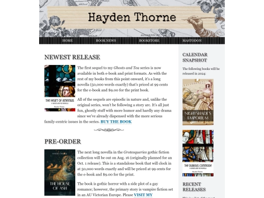
My site will be a bit wonky today with dead links and so on, but I'll be fixing all that later after work.
1 like
I reverted back to the more accessible and widely used web fonts (Georgia for serif, Arial for sans-serif). One can get carried away looking through a bajillion different font types. At the end of the day, is my site easy to read?
I really enjoyed playing around with the test page. The code's more streamlined, the look's more streamlined, and whether or not it'll be the new look of my site is still up in the air. At least I have a better grasp on stuff now.
1 like


After sitting on a pretty lush design for a while, I find that I really, really miss having a lot of white space.