seems like a ghostscape hiatus is upon me: between thesis-writing and house-renovating, my hobby time is limited/non-existent right now :|
9 likes
1 like
 ghostscape
10 months ago
would like to keep up the garden pics at least, the vegetal pals are doing pretty well
obsessed with the castle on your main page. youre very skilled at the pixel art great work + im excited for the future of ur site :)))
1 like
7 likes
your site's so much fun! Mister and the degus (great band name btw) are adorable :)
1 like
1 like
I love pixel art and love this website! keep it up!
1 like
1 like
1 like
7 likes
 ghostscape
11 months ago
neeearly up to date, and then I get to lift my self-imposed ban on making new rooms
3 likes
 automatic-llama
11 months ago
Very interesting and engaging format! Looking forward to seeing new additions!
2 likes
 ghostscape
11 months ago
@llama thanks so much! it's been fun making these as little mini projects, glad the output is entertaining to people other than me!
1 like
 nohappynonsense
11 months ago
Very interesting and engaging format! Looking forward to seeing new additions!
5 likes
5 likes
3 likes
 ghostscape
12 months ago
damn, think the herbarium update last week took me over 7MB. simultaneously feels like a lot and like the tiny amount that it is
1 like


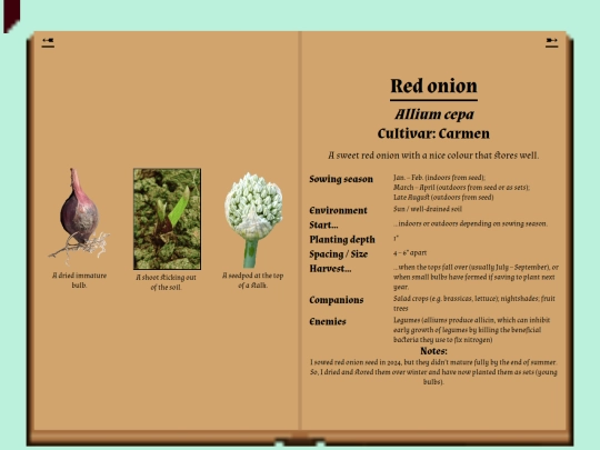
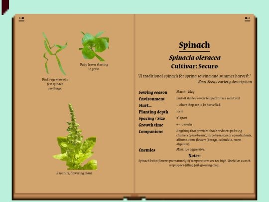
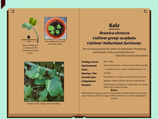
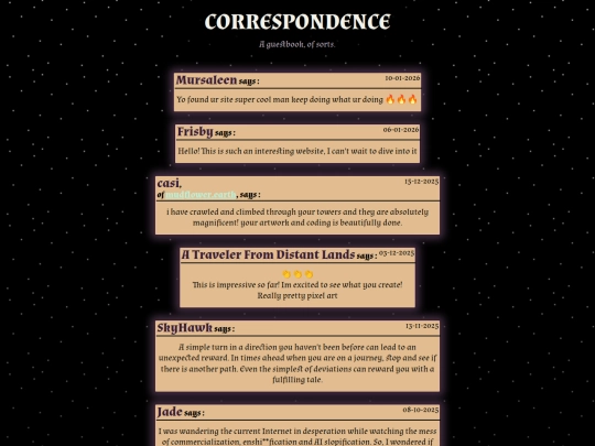

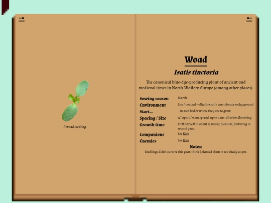


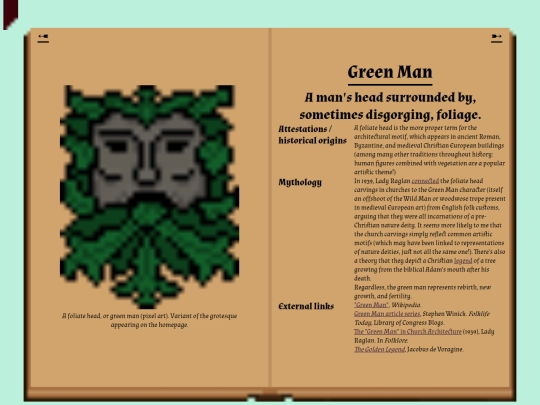
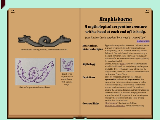
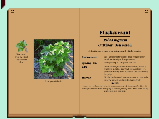
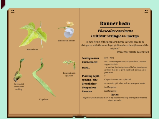
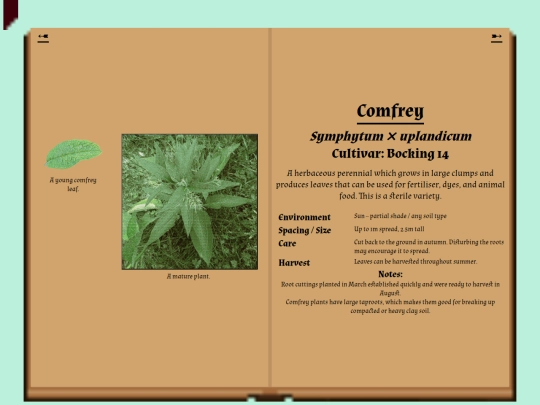
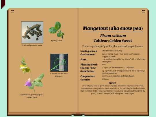
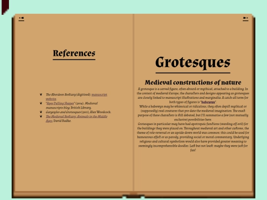
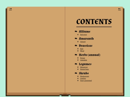


small, teeny, sticking-my-nose-back-in kinda update. still in thesis hell. missed the tower. hi everyone!