
jagodke,
poisonp1nk,
lumietta,
vwrites,
mynamespixel,
hihijihi,
yumyumcookie1,
luckyclovers,
ultrawr,
advelos,
nixiebunnie,
caenine,
error1668,
lemonadehammer,
kodragon,
catlico,
shycat,
sweetangelsxoxo,
kairiskey,
noxsworld,
keeri,
bunglepaws,
abulove,
maplesyruplesandwiches,
99zip,
farawayworlds,
bluurrediary,
supersburbchic,
saberscythe,
naviimiu,
cyberponiez,
velette,
cottonjewel,
wrender,
katipan,
nicegirlslumber,
sunnishinez,
myepicsite424,
uyumuyu,
pennylovespandas,
offizisinyourhouse,
dm39,
kagechu2005,
miet,
lunabelle,
rosehip,
alephdata,
kawaiikittykore,
thepinklair,
ayebz,
misfitpixie,
tabf5,
puddingcat,
poemdoe,
quizasmellameori,
fries-and-ice-cream,
sealredglasses,
iyanabroch,
butteroncookies,
dumby
(ᵕ—ᴗ—) Something very silly happened when i was redesigning one of my sonas, i followed the trace of a body part from another character that isn't mine when trying to imagine a preview and i loved so much how it looked like in mine's that i can't figure out an alternative..
8 likes
i love ur site! so cutes :3
1 like

Oh Dumby,, (;ω;) I'm very sorry but it seems like someone stole your code again https://neocities.org/site/my-site-audrey
4 likes

thanks a super duper lot for the follow-back!! (˶˃ ᵕ ˂˶)
1 like

i love ur website sooo much omg!!!
1 like
1 like

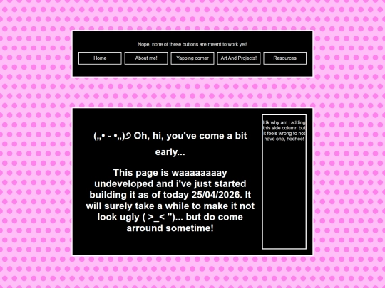

Hewo hewo! I've been thinking and i wanted to ask,, would you likey to be internet neighbors? ⸜(。˃ ᵕ ˂ )⸝
1 like

1 like


(ෆ˙ᵕ˙ෆ)♡ thanks a super-lot dear!!