 8ballreject
1 week ago
thank you so much!!!!! right now i'm just getting started by penpaling on the web but i really wanna try with letters and stuff later on :-)
 oceanfront
2 weeks ago
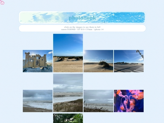
YES 🥲🥹 my photobook is revamped..! it should be much easier to navigate, and that is also thanks to andisarchive for making me realize that i can tag images💔a life changer... anyway let me know what you guys think!
 oceanfront
2 weeks ago
im also a little curious as to how you set up your lightbox in your scrapbook section, coding them has always been a pain in the ass so id love to know how you did it 🥹
 andisarchive
2 weeks ago
hiii, omg that's really sweet! thank you so much! ur site is super cute and i love the color scheme and jellyfish :) !!
 andisarchive
2 weeks ago
as for my scrapbook section, i watched a few different youtube vids on it but i'm using html, css, and js, js is the code that actually gets it to work tho. basically i have one hidden div that lives at the bottom of my html that acts as the lightbox, it's invisible by default and it covers the whole screen with a dark background (as seen on mine). (1/2)
 andisarchive
2 weeks ago
when you click on one of my olaroid cards, js grabs the image and caption from that card and then copies them into the lightbox div, then adds a class called "active" to it which switches it from hidden to visible. i styled it with “position: fixed” and a “high z-index”, mine is at 1000, so it lies on top of everything else on the page, and “display: flex” to center the image in the middle of the screen.
 andisarchive
2 weeks ago
my centering isn’t perfect but i gave up on caring abt it lol. for closing it, i have a little x button in the corner that, when clicked just removes that "active" class, making it disappear again. i also added a listener so that if you click anywhere on the dark background outside the image, it closes too. the main thing to understand is that there's only ever one lightbox div on the whole page.
 andisarchive
2 weeks ago
instead of making a new one for every photo, you just keep swapping out what image and caption is inside it each time someone clicks a different card. lmk if this helps!! i tried to explain it thoroughly lol. I can look for the youtube vids i watched, and also feel free to look at my code as well to get a better understanding if you're more of a visual learner!
 oceanfront
2 weeks ago
omg thank you for such the detailed description!! and YES i thought i understood it but i didnt even realize there was js, i think i missed that line 😭 dont worry about it but if you do find those videos i would love to see them!
 andisarchive
2 weeks ago
yayyy!! happy to hear you’ve got it sorted, jus in case you change ur mind the video I watched was by dcode https://youtu.be/dylA5Onz3kI?si=XmjIbRha0WMZJZLK
 oceanfront
2 weeks ago
do you know why the lightbox only opens when there's a caption div? that seems to be my main issue, images w/o captions cant open their own lightboxes
 andisarchive
1 week ago
hmmm i'm not sure it could be because js is specifically looking for the caption and when it's not there it's viewed as an error? you might want to make sure the listener is on the whole “.polaroid” card, and when grabbing the caption just add a check like "if a caption exists grab it, if not just leave it blank" so it doesn't break when there's no caption there
 n-has-a-site
2 weeks ago
That just means its peak bro. My fav movie is an elephant sitting still and i think people will find that boring doesnt mean its less peak though.
 oceanfront
2 weeks ago
ok so i legitimately thought u meant an elephant standing still and i was like.... ok lets talk..... but i realize that is an actual movie now LOL



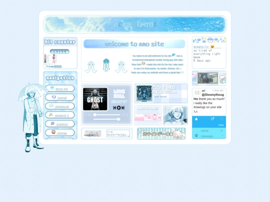
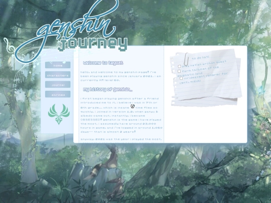


THANK UUUUU ♡ i’m so happy to see someone appreciating it as much as i do! it’s not my original idea, but i really love that cozy corner :3 AND YOUR SITE IS JUST AS GORGEOUS I LOVED IT SAUR MUCH T^T