jade-everstone
2 years ago
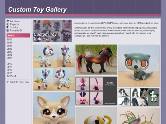
Some offsite updates today. Decided to update the galleries on my portfolio site + carry over the masonry layout from my main site. Since it's more of an application resource vs an overall archive, that's site is more of a highlights section / I rotate things out on there as needed: https://portfolio.jadeeverstone.com/
1 like
1 like
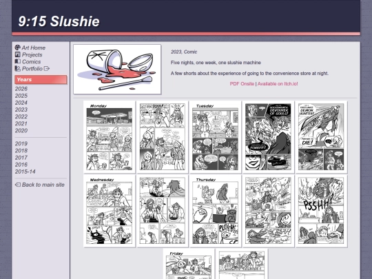
Mostly smaller site tweaks & fixes today, but I've also mirrored 9:15 slushie onsite: https://jadeeverstone.com/art/comic/slushie/
Just posted my first full-illustration of 2024: https://jadeeverstone.com/art/2024/


![auberylis [dot] moe avatar](/site_screenshots/34/10/astrossoundhell/index.html.50x50.webp)


