
Starting my new job tomorrow and finally cleaning up my living space, THE ROT IS OVER!! for now...
17 likes

3 likes
In love with this site but i'm doing the text adventure and can't figure out what the destination on the kiosk is supposed to be :(
1 like
 hello-room
4 months ago
hello-room
4 months ago
thankyou sm :)) have you tried examining everything else in that room? There are some clues as to where you might need to look
Crawling into bed at 1pm fully clothed to sleep for 5 hours, best I've felt all week
9 likes
your photos and art is super cool bro! do u have a button for ur site?
2 likes
hello-room
4 months ago
Thankyouuu :)) and yes I do, it's under the links / contact bit on the right hand side of my page :)
1 like
Cool site
1 like
1 like
10 likes
hello-room
5 months ago
Does it look weird to have the sky move like that? I not sure if it would have been better to leave it as a single frame
1 like

3 likes
 kirbydogs
5 months ago
kirbydogs
5 months ago
it actually looks very nice, quite calming to look at it... almost like a nostalgic feel to it?
1 like
1 like

1 like
Thank you for the kind words! I love your pixel art, and totally relate to loving nature claimed technology! Also I love that you like the black and white dithered style! I actually made my kpop bias list in that style haha. (if you wish to peep, i need to link it still on my actual site, whoops.
https://krissatiel.neocities.org/bias )
2 likes
 krissatiel
5 months ago
krissatiel
5 months ago
but it will never not amaze me how much detail can get across in only 2 colors!
1 like


![[tfpXE] avatar](/site_screenshots/15/25/tfpxe/index.html.50x50.webp)


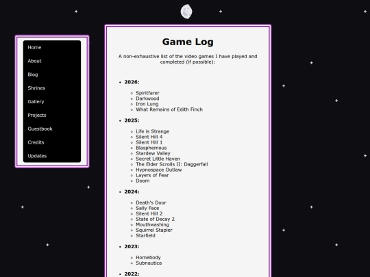
Did you play Iron Lung because of the movie?? Either way, I love that game ദ്ദി(。•̀ ,<)
haha yeah, I remember watching people play it when it came out and thought it was really cool, then the recent hype around the movie reminded me of it