 somatheworld
1 month ago
OMG FELLOW SOUTH ASIAN!!! i’m american but my family lives in hyderabad!! thank you for the compliments.. (thank you for offering your sudoku code!!)
 milk-tea
2 months ago
i truly am the last person you should’ve asked this because every piece of js on my site has been obtained through thievery or bruteforcing already existing thieved code to fit my uses 😭 but w3school did help me out whenever i was in a pinch starting out!
 sweet-pea
2 months ago
honestly i think youtube tutorials are really good, the w3schools tutorial confused the heck out of me so i turned to youtube. the tutorials are like 20+ hours long though sob
 milk-tea
2 months ago
@sweet-pea the youtube videos were so formal they lowk scared the living hell out of me, i guess seeing actual js code in work while matching it up with w3school articles is the workflow that worked best for me
 strawberry-transneu
2 months ago
i write almost all my js by hand !!!! i knew general coding before tho and that helped.... try to search for guides that rlly has THE BASICS. Also w3schools actually isnt THAT bad!!! but a lot of js learning is like. Figuring out 1 feature you need, googling "how to make [x] js" and trying to understand it. And then repeat it x500 times ig
 milk-tea
2 months ago
genuinely sucked having to put up with the external source restrictions as someone that made an account in 2024, and i kinda didnt wanna give kyle any money for the barest minimum
 angelsaremathematical
2 months ago
Yes! When I wanted to try out making a site, I didn't come up with a name yet, but already wanted to host it to check out how neocities works. And I picked this line as a temporary name, intending to swap it for something shorter, because this is kinda ridiculously long for a website URL
 angelsaremathematical
2 months ago
Somehow, it stuck, but it works well. The name sounds nice and evokes an interesting image. And people who like Coil instantly recognize the line
 angelsaremathematical
2 months ago
I also probably picked it at the time when I was under the impression that studying math will make me see the world differently and open up some new hidden knowledge about it (never happened)
 milk-tea
2 months ago
love this...sometimes whims do have a way of cementing themselves into lasting miracles and personally i agree with you on it being an evocative and mystifying phrase...def makes anybody that reads it to want to visit! (i feel the same way about physics lol)
 sweetcharm
3 months ago
omg thank you ;o;!!! I've been updating it I Just don't always go through neocities to do it lol!!!





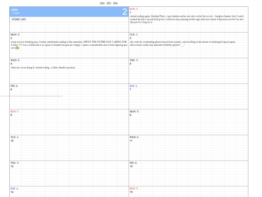
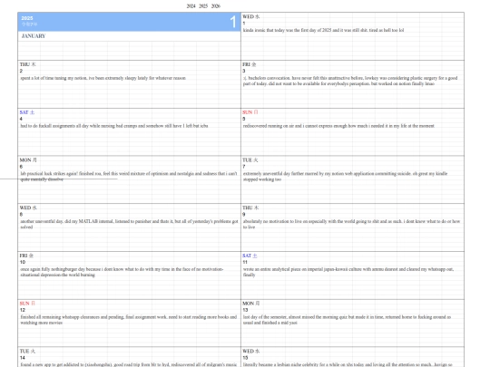
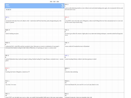



thank you so much !! <3 I'm always afraid that my blog posts are too boring :3