
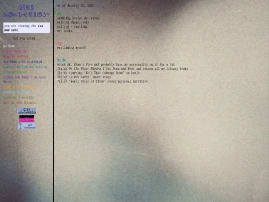
girl-wonderlost
75,460 views
178 followers
13,450 updates
0 tips
8 likes
7 likes
4 likes
7 likes

1 like
8 likes
9 likes
2 likes
10 likes
 girl-wonderlost
2 months ago
girl-wonderlost
2 months ago
adding music i like... sometimes i forget things i like so. i have to put them somewhere.
2 likes
i really enjoy your music on /practice.html [especially nov. 7] and also thank u for introducing me to bill wurtz. i was passively aware of him, but now, a fan. i watched his animations "perfect" and "out to lunch" and fell down some really wonderful rabbitholes. hope you're well!
4 likes
girl-wonderlost
2 months ago
he gets so many questions on his site. 1.31.26 11:58 pm i liked a lot: ...how do you keep yourself from living in your head... a: "there should be a pleasant surprise just around the next corner. basically all you have to do is try not to miss it"
1 like
 misswindow
2 months ago
misswindow
2 months ago
sneaking in this conversation but omg bill wurtzzzz i used to be such a fan back in high school
2 likes
 d60010
2 months ago
d60010
2 months ago
omg thank you so much and i'm so glad to see more bill wurtz appreciation i feel like he's so underrated
1 like


I wholeheartedly endorse all these wishes
good luck on the piercing appointment!!
thank you my friends!