Websites
Search
Activity
Learn
Support Us
Sign up for Free
Sign In
Neocities.org
tower of old data
kaa.neocities.org
270,511
views
123
followers
6,727
updates
0
tips
Share
kaa
teethinvitro
10 months ago
Your new drawings and writings are good, thank you for sharing!
2 likes
teethinvitro
10 months ago
(Extremely late reply) Thank you for perusing, friend.
kaa
cofybeans
10 months ago
Beans, I step on leaves too! I'm like totally an adult, I swear.
2 likes
cofybeans
10 months ago
excellent
1 like
kaa
pastamasta09
10 months ago
Thanks for your photos.
2 likes
kaa
newperspective
10 months ago
Thank you for your social commentary. Your perspective is valuable.
2 likes
kaa
10 months ago
Knock, knock.
1 like
kaa
updated their site.
10 months ago
lied
4 likes
kaa
fernandviolet
10 months ago
Have fun!
2 likes
kaa
10 months ago
If you understand what I'm saying, tell me!
2 likes
kaa
updated their site.
10 months ago
lied
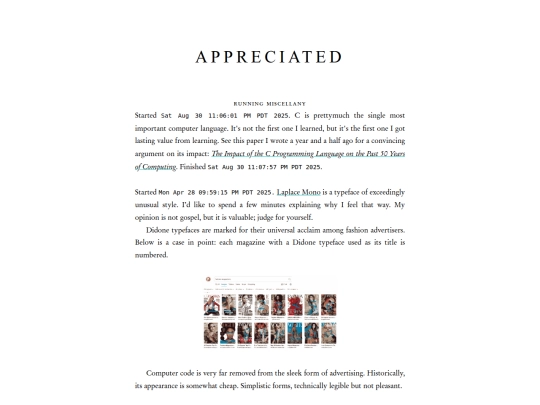
appreciated
4 likes
kaa
updated their site.
11 months ago
lied
2 likes
1
2
…
11
12
13
14
15
16
17
18
19
…
50
51
Website Stats
Last updated
1 month ago
Created
Mar 1, 2022
Site Traffic Stats
This site follows
Followers
Tags
music
photography
animation
writing


(Extremely late reply) Thank you for perusing, friend.