Neocities.org

crossroads

kaa.neocities.org

180,559 views
45 followers
5,927 updates
0 tips
As has become a habit, I went out on a walk, and took a couple photos that I feel are worth sharing.
3 likes
3 likes
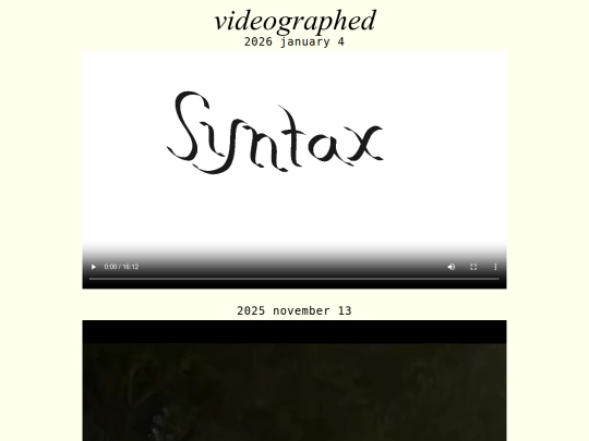
I had drawn a psuedo-animation over the course of some months, and have now shared it. It is particularly flashy in nature, and perhaps was a poor use of time.
1 like
kaa 1 year ago

I was recommended to turn down the framerate. Rather than 24 frames per second, the video is now at 6. It no longer hurts to watch.

1 like
kaa 1 year ago

A photograph initially too dark to view has been carefully remastered from the raw capture, and has now been shared.

1 like
2 likes
I went out on a walk and took some pictures, two of which I felt were interesting enough to share.
4 likes
teethinvitro 1 year ago

It's always a pleasure to see your photographs.

1 like
kaa 1 year ago

I'm glad!

2 likes
kaa 1 year ago

In addition, I have now made some small amendments to the page of appreciations. I have found that Edward Tufte has collaboratively developed a digital typeface, https://edwardtufte.github.io/et-book/. Previously, I had mentioned finding value in OpenType features and PostScript metadata, yet did not have a document to display their use. That has changed: https://kaa.neocities.org/PDF/chem-2-9.pdf.

2 likes
kaa 1 year ago

And a small nitpick of a change in style: mid-sentence parenthetical mentions are now surrounded by spaced en dashes, rather than em dashes.

2 likes
kaa 1 year ago

I had done some practice drawing letters this previous friday, and today I completed a small sketch, each of which I have shared.

2 likes
3 likes
I had previously failed to find a web-accessible document demonstrating neatroff's Farsi capabilities, however I have now found one published by neatroff's author, at https://litcave.rudi.ir/neatfarsi.pdf. In addition: I now understand the value of small caps and old-style numerals accessible as OpenType features, and have come to mention an iteration of URW's Garamond No. 8 that does just that.
3 likes
3 likes
Having read partway into Chapter 2 of The Elements of Typographic Style, I have come to realize how difficult to read a long line can be. With the magic of sizing the font based on screen width, and larger margins, lines are now generally 65 to 70 characters in length, regardless of display width.
2 likes
kaa 1 year ago

A teensy weensy bit of a third color felt like it could do well to act as a sort of accent, and so the underlines of links are now turqoise.

2 likes
kaa 1 year ago

s/turqoise/turquoise

2 likes
3 likes

Website Stats

Last updated 5 days ago
CreatedMar 1, 2022
Site Traffic Stats

Tags

music photography programming animation