
Wayne's Place: "A Dream You've Had Before."
65,629 views
176 followers
9,536 updates
0 tips
How do I make my banner on my index cover all 3 columns so my index looks better on phone? It’s the only thing that looks weird but I don’t want my banner to also look weird on iPad or Computer by making it fit over the columns on phone. Idk how to explain hopefully this makes sense
7 likes
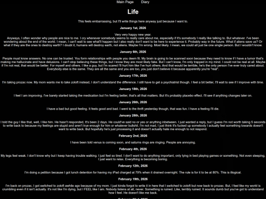
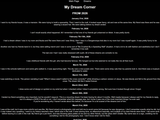
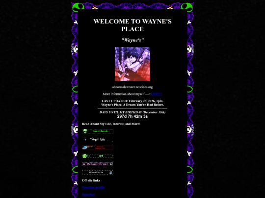
11 likes

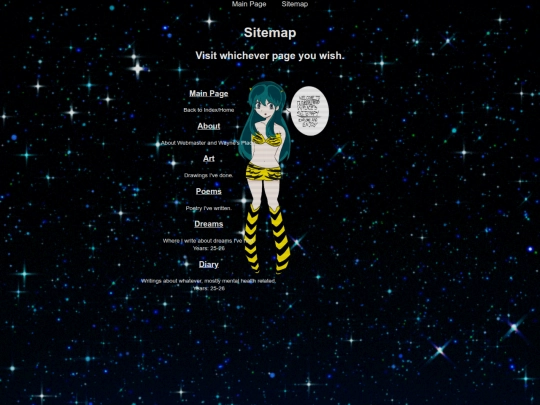


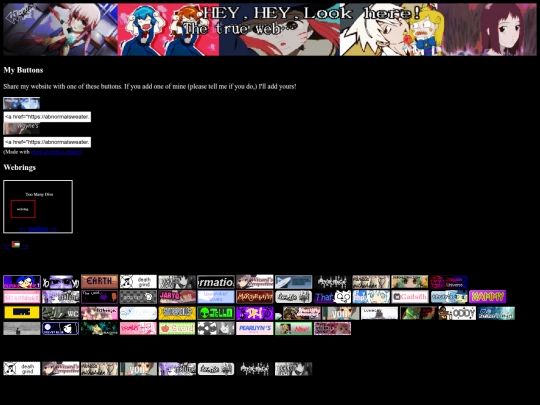
15 likes
Wish I named by site waynesplace instead of abnormalsweater. Regrets, regrets. But I’m too worried to rename it.
13 likes
 ellevee
4 weeks ago
ellevee
4 weeks ago
i think it would be ok to rename! you could change all the links on your end, problem is others changing links on their end... but maybe it would be ok in time idk :,)
4 likes
 draggianuniverse
4 weeks ago
draggianuniverse
4 weeks ago
When I changed my URL in 2022, I made another site (using a different email) with the old URL and set it to redirect to the new one. That way any links that didn't get updated would still point to me.
2 likes
i love your site! really cool visual style :)
1 like
1 like
14 likes
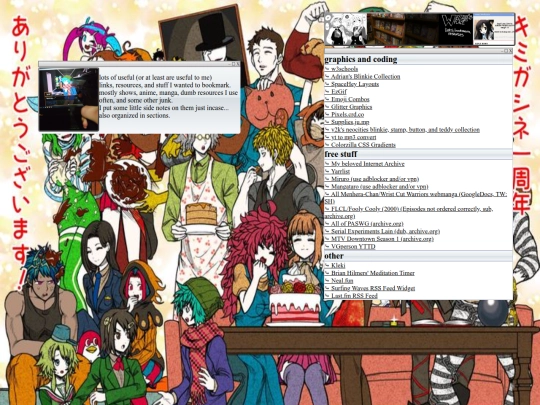
I made a button >:)
1 like
1 like
Heyoo added your button to my site! Looking forward to seeing more of your OC art :0
1 like
1 like
Everytime I open up my laptop I have to manually turn it on and most of the time that it IS on the screen is black. If I can see the screen, it says that something went wrong… idk what to do I mostly code on iPad but I change lengths and widths depending on how it looks on laptop… idk how to fix this
6 likes

2 likes
 abnormalsweater
1 month ago
abnormalsweater
1 month ago
@Phailsnail it’s black at boot up.. I’ve tried a lot of ways to get it back to work but nothings been working aside from waiting and even then it’ll only show my lock screen
1 like
2 likes
 didntask
1 month ago
didntask
1 month ago
always like this or just started recently? what OS? check any changes to your power/lid close options? idk but it sounds like it's set to shut down on the lid closing? when you say "most of the time it's on the screen is black", do you mean you'll be using it normally, leave it alone, and come back to the screen being black? after you get into your lock screen, does it work normally once you log in?
2 likes


![[HIATUS] blinkies blinkies blinkies avatar](/site_screenshots/89/22/blinkie-net/index.html.50x50.webp)


You can use the @media css rule to change properties depending on screen-size. E.g. @media(max-width: 1290px){ colour: red; } would make the text colour of the page red if the page is less than 1290px in width, which is the amount I use for changing the layout for phones on my site. I can't inspect your code rn Im not sure if thisll be any help but maybe a flexbox could help also
just inspect your index, if you were using that column-wrapper I suggested, you should use it only at the top level, all the other divs (left, center, right) inside of it (not each inside a new column-wrapper), flex and width values are conflicting there, it seems like you want center 60% and the other two 20%, so on center-column you can just write flex: 3 (flexbox count becomes 1x+3x+1x = 100%, x=20%)
if view stills weird on mobile after that, then use media css rules like @irrelevantreviews said, you add his example to style and then inside of it you add a new header, like @media(max-width:XXXXpx){ header {your property changes here} } (that XXXX is because it's different values for phones and tablets, usually 768px for phones and 1024px or 1200px for tablets), fixing one might not fix the other, so you may need
a different set of rules for each)
argh, my english, first message was supposed to be "I just inspected your index, if you are using that"
to @irrelecantreviews: "colour" man get yo british ass outta here
I set my mobile layouts based on portrait vs. landscape orientation -- that probably isn't the best way to do it, but I know there are some heckin wide phones these days and generally speaking, a vertical window is probably a phone.