
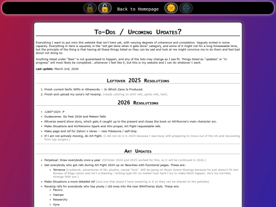
I'm aware that this may sound like whining, and I don't intend it to be interpreted as such. Anyway, I'm getting fewer Art Fight attacks than I did in 2024, and I'm not sure why. I filled out a bunch of hitlists, I have more characters, and I'm doing more attacks, so I don't really understand the problem. I'm aware that anthro snakes aren't all that popular, but I have some new Pokemon kids I was expecting more for?
1 like
1 like
found a ca. 2012 business tower at the thrift store for 25 CAD today, then went to a local place to get a RAM stick to test and they just...gave it to me? for free???
needs a new hard drive but it does in fact boot. I'd been looking for a desktop bc I think the notebook that got me through my bachelor's is on its last legs and this is way cheaper than refurb on newegg 😎
1 like
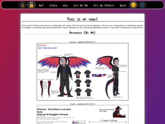
guys look at my snake hoodie I made (also on /TheEnforcer with the other cosplay gear under "me IRL")
stitch gun is the best fucking purchase I ever made
https://draggianuniverse.neocities.org/images/theenforcer/irl/enforcer_hoodie_front.jpg
https://draggianuniverse.neocities.org/images/theenforcer/irl/enforcer_hoodie_back.jpg
https://draggianuniverse.neocities.org/images/theenforcer/irl/enforcer_hoodie_close.jpg
2 likes
1 like


Sometimes you just have to be in it for the love of the game. The front page recommends making more attacks, but sometimes people just aren't gonna bite no matter what. Maybe find other anthro snake / pokemon kid artists? Disclaimer: I've not participated in art fight but I'm familiar with the disappointment of the internet.