Websites
Search
Activity
Learn
Support Us
Sign up for Free
Sign In
Neocities.org
tower of old data
kaa.neocities.org
269,048
views
123
followers
6,727
updates
0
tips
Share
kaa
updated their site.
1 year ago
index
3 likes
kaa
catarinha
1 year ago
:)
2 likes
kaa
1 year ago
Moving photos to an external site.
4 likes
kaa
1 year ago
Done.
2 likes
siqu
1 year ago
much faster load
2 likes
kaa
updated their site.
1 year ago
photographed
photographed/2024-09
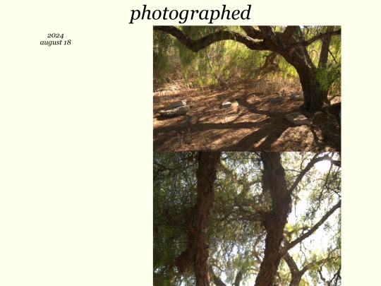
photographed/2024-08
photographed/2024-07
photographed/2024-06
photographed/2024-05
photographed/2024-03
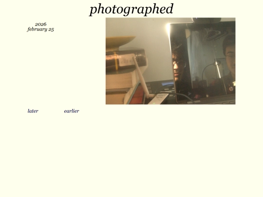
photographed/2023-11
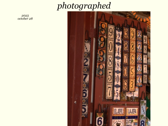
photographed/2023-10
photographed/2023-08
4 likes
kaa
updated their site.
1 year ago
photographed
photographed/2024-08
photographed/2024-07
5 likes
kaa
updated their site.
1 year ago
photographed
photographed/2024-07
3 likes
kaa
updated their site.
1 year ago
videographed
3 likes
kaa
updated their site.
1 year ago
photographed
photographed/2024-07
photographed/2024-06
2 likes
kaa
updated their site.
2 years ago
composed
3 likes
kaa
updated their site.
2 years ago
drawn
drawn/2024-06
files
photographed
photographed/2024-06
photographed/2024-05
photographed/2024-03
photographed/2023-11
photographed/2023-10
photographed/2023-08
3 likes
1
2
…
20
21
22
23
24
25
26
27
28
…
51
52
Website Stats
Last updated
2 weeks ago
Created
Mar 1, 2022
Site Traffic Stats
This site follows
Followers
Tags
music
photography
animation
writing


Done.
much faster load