

3 likes

2 likes


4 likes

8 likes

7 likes

3 likes

6 likes
4 likes

4 likes

1 like
hiii i'll prolly submit something eventually but i did wana show u this one other cone photo i took forever ago https://twelvemen.neocities.org/2/photos/juckport.jpg thank u bye bye
8 likes

1 like

1 like


3 likes


4 likes

2 likes


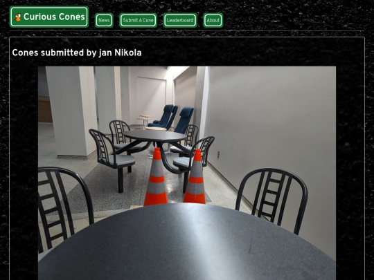
those two cones behind the table are on a date!!