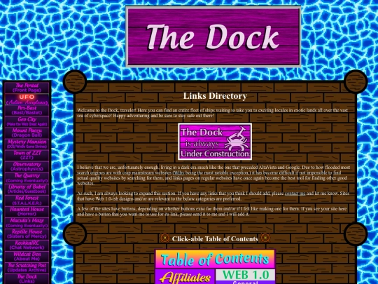
For anyone who's paying attention, I just updated the Dock/Links page for the second time today. Forgot I had 8 more links to add after I put up the first update, and I guess Neocities only registers one update per 24 hours.
2 likes
Greetings from the United States! I just wanted to say that your website, especially the front page, gives me an incredible feeling of nostalgia for how great the web used to be 20+ years ago. Good job and keep up the good work!
1 like
 buriedalive
5 years ago
thank you so much, that's so kind of you :>!! i love the vibe of your website too, looks like something from the late 90's/early 00's! <3
1 like
1 like
1 like
1 like
 lolwut
5 years ago
A good essay from you today. My preference for writing over videos is one major reason why I don't follow or regularly watch any YouTube channels.
1 like
 koshka
5 years ago
Thank you for liking and commenting on this, my friend. I don't spend that much time on YouTube either. It's just too much of a hassle to force myself to focus on listening to someone talk if I can just find something on the subject that is in text.
1 like





![[ cave of kelpius ] avatar](/site_screenshots/28/07/kelpius/index.html.50x50.webp)


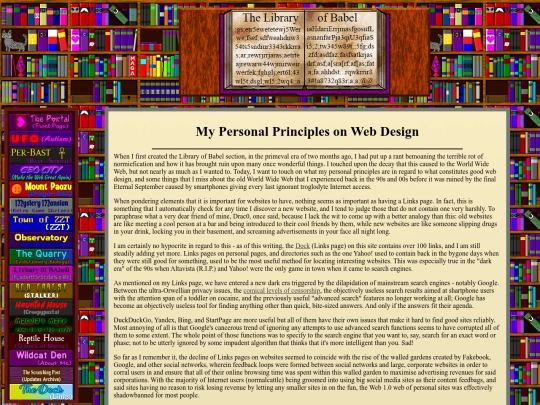
Very good principles. I would say that fast and lightweight "true" minimalist design, wildy creative maximalist design filled with MIDIs, animated GIFs, tiled backgrounds, etc., and everything in between are fine; but what I cannot stand are the bloated, childish, mobile-centric "chickenshit minimalist" designs that have become so commonplace these past several years. (I assume you know the ones I'm referring to.)
Thank you for your kind words, my friend. I agree entirely about those sorts of websites. They're unironically more awful looking than any website of the distant past, while paradoxically consuming vastly more resources. Almost like the web equivalent of those luxury faded/dirt-covered jeans.