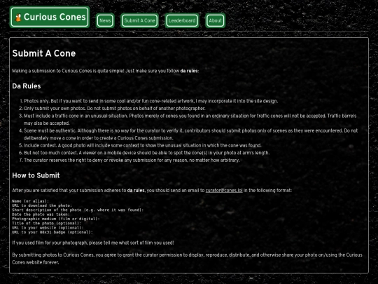
big update to site design. would appreciate feedback. I'm particularly interested to know how people feel about the readability of the text against the background.
I think the text in the road sign like bubbles reads great and is a really cute idea. But I think when its got nothing behind it, it does get hard to read against the textured background. If you used the road sign background for all text, I think that'd help immensely.
The way I had to implement the road sign look is not something I can do in Hugo to render all text that way. I could just rewrite all pages in HTML instead of Markdown, but I don't want to do that. I'll play around a bit in the coming week with adding a darker background behind paragraphs. I already have a dark shadow on the text. It may just be a matter of increasing its size.


big update to site design. would appreciate feedback. I'm particularly interested to know how people feel about the readability of the text against the background.
make sure you Ctrl+F5 to reload the main CSS file too
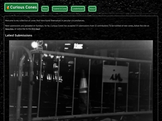
reads fine, could use more cones tho
I think the text in the road sign like bubbles reads great and is a really cute idea. But I think when its got nothing behind it, it does get hard to read against the textured background. If you used the road sign background for all text, I think that'd help immensely.
The way I had to implement the road sign look is not something I can do in Hugo to render all text that way. I could just rewrite all pages in HTML instead of Markdown, but I don't want to do that. I'll play around a bit in the coming week with adding a darker background behind paragraphs. I already have a dark shadow on the text. It may just be a matter of increasing its size.