
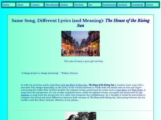
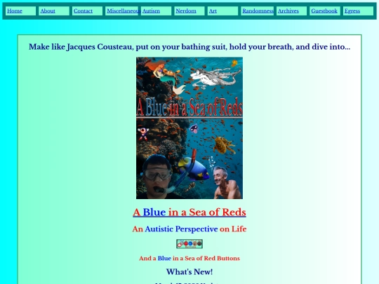
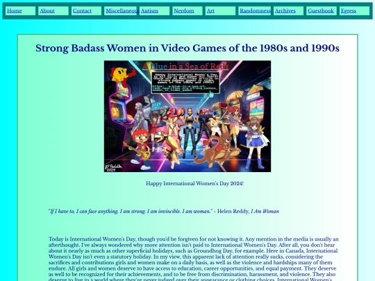
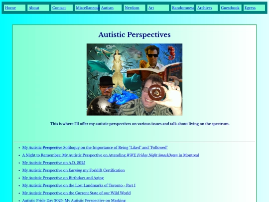
A Blue in a Sea of Reds
a-blue-in-a-sea-of-reds.neocities.org
228,983 views
48 followers
8,088 updates
0 tips


3 likes

5 likes
2 likes

4 likes
3 likes
 ocrevol
1 year ago
ocrevol
1 year ago
this is an interesting one. I think I slightly prefer the 1st edition cover for Jaws, but the movie poster is iconic. slightly prefer the Japanese Ecco cover for the layout/design, even though Vallejo's art is more compelling. absolutely hate the anniversary cover of Clockwork Orange, I am a certified Penguin hater but they do know how to make pretty books.
1 like
ocrevol
1 year ago
fun fact on the Penguin edition of Clockwork Orange - the cover is textured and the orange is embossed, added sensory details to the minimalistic visuals. didn't think about it being a representation of the milk before you mentioned it but that's a good theory
1 like
 a-blue-in-a-sea-of-reds
1 year ago
a-blue-in-a-sea-of-reds
1 year ago
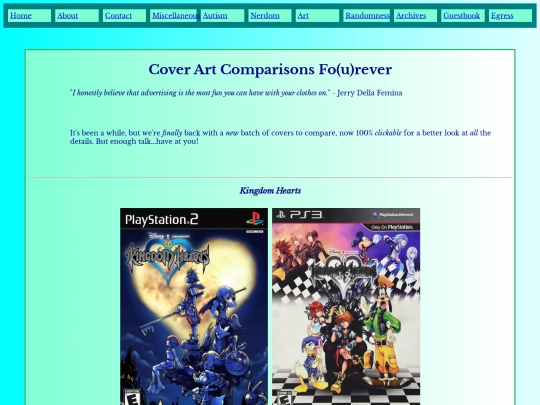
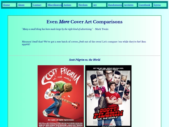
Which cover and poster do you prefer with regards to Kingdom Hearts and Tom and Jerry: The Movie, respectively? I’m not too familiar with the world of book publishing, so forgive my asking, but why are you a certified Penguin hater?
1 like
a-blue-in-a-sea-of-reds
1 year ago
Wow, I didn’t realize the minimalist cover of A Clockwork Orange was textured. Cool, I love embossed book covers. As always, thanks so much for your feedback, Ocrevol. 😊
1 like
ocrevol
1 year ago
I think I agree with you on the Kingdom Hearts poster, but slightly prefer the daytime edition of Tom and Jerry - more movement and detail in the image.
1 like
ocrevol
1 year ago
the Internet Archive debacle was what informed my decision to avoid giving Penguin (or Hatchette, or HarperCollins) any of my money in the future but they've been noted for poor translations and terrible editorial for a long time prior (deteriorating print quality too, but that's something everyone's struggling with these days)
1 like


Clayfighter 63 1/2 was such a weird game. It wasn't that good (I rented it at Blockbuster way back) but the sheer novelty made it not actually bad at the same time.
Indeed, ClayFighter 63⅓ may not have been a perfect video game, but it sure had its fun and quirky charms. I love that it embraced its eccentricities, and dared to be different, opting for a stop-motion clay aesthetic, at a time when blocky polygonal graphics were all the rage. 👏 To me, Sumo Santa will always be the coolest aspect of ClayFighter 63⅓. 🎅
By the way, I love your button featuring the mouse photographer from Link’s Awakening DX (that photo album side quest was lots of fun). 🐭📸 In fact, it’s the button I chose to link (pun intended, ha-ha) to your site. Thanks so much for your feedback, Hardmachine. It’s much appreciated. 😊