 strata
8 years ago
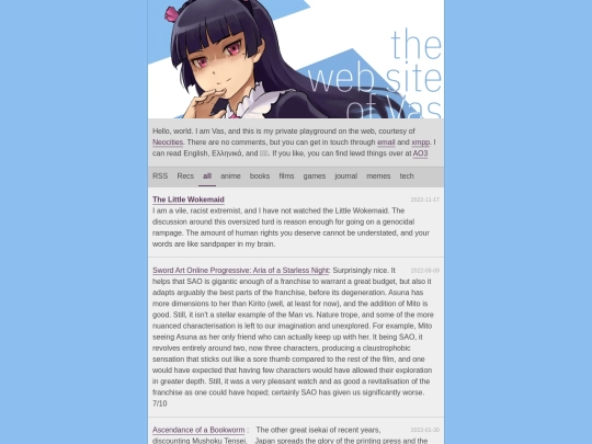
Yes, I know this and I'm honestly sorry about it. Problem is: it's only 500px on desktop. My phone has a portrait width of 1080px so I adapted for that. And even then I ran everything through guetzli on quality=87 for the (in my opinion) best trade-off between size and quality.
 strata
8 years ago
These images are very high in detail and running them through shitty encoding settings makes my heart ache. Having visitors download 1MB for the frontpage also makes my heart ache, but just one percent less. it's a dilemma :/ (but I'll try to decrease the size and see if it looks acceptable on the phone™)
 strata
8 years ago
Still, thank you very much for your valuable input. It means a lot to me when people notice these details.
 vas
8 years ago
I only noticed cause things usually load instantly with neocities' crazy CDN lol. It's okay. Seriously, just try mozjpeg. You save 50+%, and all you lose (from what I see in my monitor) is a tiny bit of luminocity in certain parts of the image which IMHO don't affect the image negatively.
 headache-booth
8 years ago
I think your site is fine how it is already, it kinda stands out in a way.
 vas
8 years ago
I don't think I'll do a major redesign. I'm leaning towards a section between the header and the blog.
 strata
8 years ago
I really like that minimalistic approach of your site. It's not old-fashioned and not black and white hype shit. But please center your background pattern.
 vas
8 years ago
I set the background-position property to be centered on the horizontal axis. I also disabled the scrolling in the background with background-attachment cause it was driving me nuts on my larger monitors. I didn't even know those CSS propertises existed, but that's CSS1 for you, I guess.


this is why palemoon exists
Why can't we have nice things? :(