
somewhat echoing caesthoffe here because it's also been on the mind but despite recognizing that i don't have to constantly update the site and i can take time for other things i do feel irrationally under pressure to do so
2 likes
a
1 like
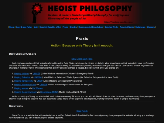
 heoism
2 weeks ago
heoism
2 weeks ago
we stay silly (I'm still writing the same document I keep having to take rest blocs)
 heoism
3 weeks ago
heoism
3 weeks ago
okay, returning sorta but to clarify I'm primarily writing off-site at the moment and doing research into a few topics, particularly the origins and purpose of the state
heoism
3 weeks ago
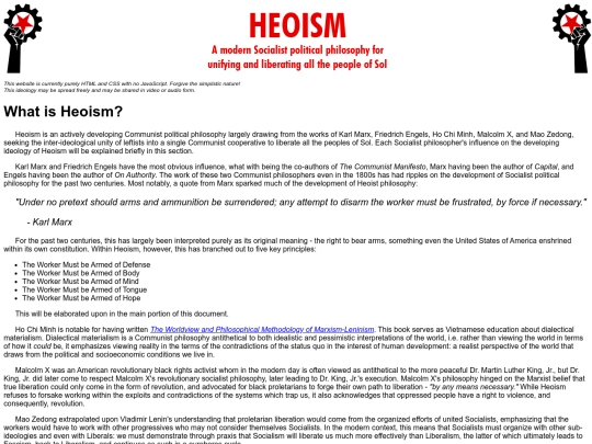
something notable lenin pointed out is clarifying that engels' discussion in anti-duhring points out that the marxist philosophers and the anarchist and social democrat philosophers (both) perceive the fall of the state entirely differently. engels stated and lenin clarified:
heoism
3 weeks ago
bourgeois state → violent revolution → workers' state → withering into nothing more than an organization that distributes commodites once class antagonisms are done away with (as the state serves as a mediator to force the oppression of one class over another, ex. bourgeois state over proletariat or proletarian state over bourgeoisie, to prevent class warfare)
heoism
3 weeks ago
the anarchist movement (bakunin and kropotkin) and the social democrat movement (bernstein, bizarrely also bakunin, and kautsky) interpreted the fall of the state as a full abolition, with a minor distinction that the anarchists presented bourgeois state → violent revolution → free association in a stateless, alegal society
heoism
3 weeks ago
the social democrats, precursors to the modern democratic socialist movement, contrarily presented the ludicrous concept of bourgeois state → electoralism in the bourgeois democracy → somehow transitioning into a proletarian state → state abolished. notably the modern democratic socialist movement has slightly altered that first stage to market socialism (or just capitalism with social protections)
heoism
3 weeks ago
that demsoc idea specifically advocating for personal benefits under whatever the current country needs to be without abolishing the systems of imperialism they benefit from
2 likes
1 like
congrats to new york on electing zohran mamdani; here's hoping y'all get the first demsoc with a backbone
2 likes
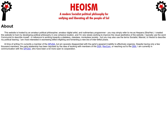
I will probably be less active here per I'm putting major focusing into rewriting The Red Star of Heoism as it needs major revisions (and I would like to expunge my kindness towards Mormonism as I have learned more about it that makes me thing its eradication is a better option than trying reformation, whereas for example Christianity could be put onto Christian Communism per Jesuit and Marxist praxis similarities)
1 like
heoism
1 month ago
I'm additionally going to be more active in the CPUSA as they're a party that actually does stuff. Like not just statements and newspapers but honest to fuck praxis, even if just in the form of community aid and raising Communist banners at protests. We've got direct coalition with the Communist Parties of Vietnam, Cuba, and Chile as well, and are with the IMCWP.
1 like


To be clear on the new note, this is largely due to reading the entirety of Imperialism, the Highest Stage of Capitalism (which I failed to update on the site as being read) to verify a claim made in one of the Communist Party USA classes, and I've almost completed State and Revolution. These two documents have created a drastic increase in understanding of Marxism-Leninism when paired with what I'd read in Capital.
This has, in turn, clarified to me: 1. I had initially misunderstood some of the concepts (for instance, withering state vs. abolished state) and 2. was far too focused on quality-of-life increases over functionally abolishing imperialism