big layout change (be sure to clear cache if u've visited before!): goodbye Tufte-style sidenotes :( u r beautiful but u make the page response to window width a bit too funny & i can't figure out a clean way to deal with it w/ simple html/css & w/o too much calculation. i'll revisit this when one day i can actually code. the current solution has its own multitude of problems but i feel cautiously positive about it
1 like
1 like
added a minimum max-width on body. now the site is (1) more responsive (?) but (2) more awkwardly so BUT (3) hopefully more accessibly so. & there's the feeling that says i'll eventually regret a lot of my choices. oh well
1 like
hi !! thank u for the nice message :3 i've been meaning to leave a comment since i read ur essay "Scripts and Sounds" about when i first followed—a really good and engaging read & the further reading list is so exciting (i did not know of An Anthology of Asemic Handwriting or the Stephen Houston paper on pseudo-scripts, so thank u for those!!). love ur website!
3 likes
1 like
 getcubed
2 years ago
woah i cant say that i know (/knew?) anything about OC or MC, but a very interesting read! glad to now know what "phonophoric" means
1 like
a somewhat big update: changed the blogpost font. ubuntu (what i originally used) has a very unique look that i really liked, but its spacing is weird whenever an italic span is followed by e.g. a semicolon. i don't want to do some any complicated tweaking involving css or the font files themselves, & having to insert a hair-space every time is obviously not the best practice, so i changed the font entirely.
1 like
 ghostologaster
2 years ago
i also decided that i want to have only two fonts as the main font: for long-ish texts, source serif 4, and for anything else, ubuntu mono. i'm liking how it's turning out so far

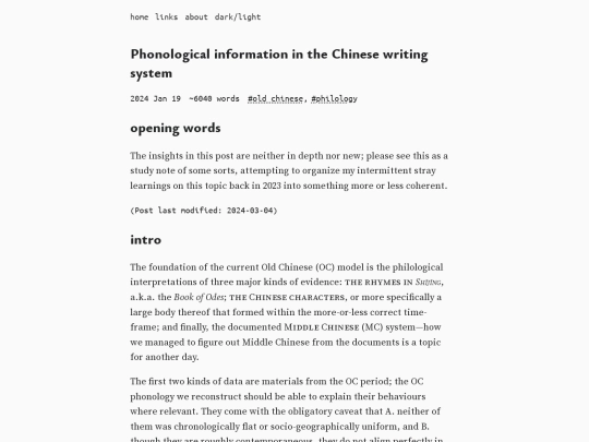
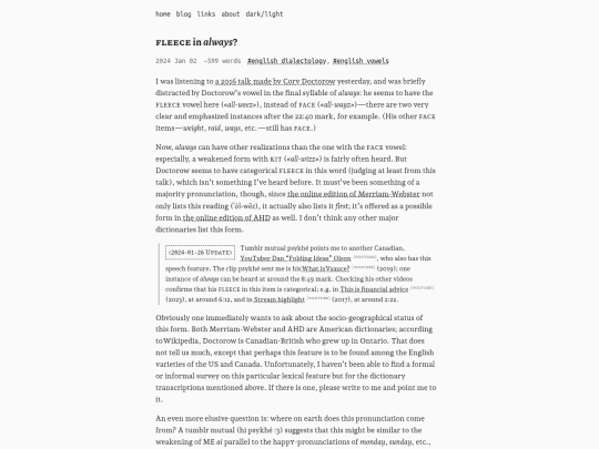
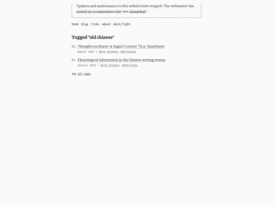
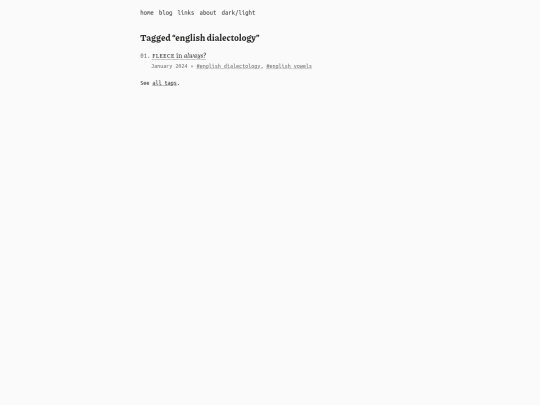
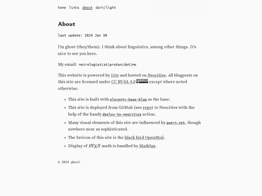
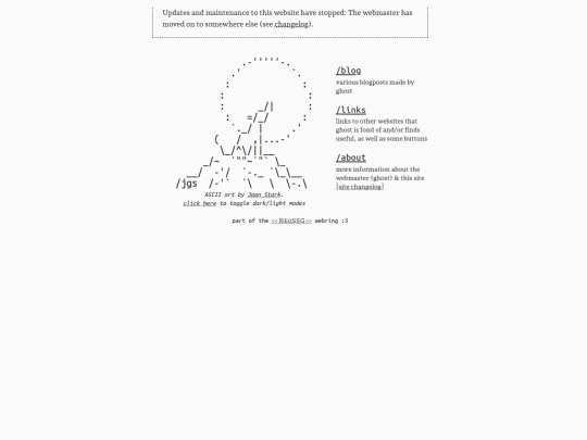


also: do you know that the fontfiles hosted by google fonts are sometimes outdated? anyways. changed the font files for source serif 4 and ubuntu mono to the up-to-date versions from official releases