
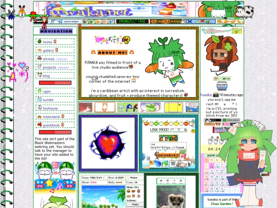
i love how colorful your site is :D
2 likes
1 like
Wow! Your website is so creative and colorful! I love it!
1 like
thank you so much for the compliment on my site btw!! :-D your site is really cute & nutritious lol! also love DDLC <4
2 likes
1 like
would someone with a bigger brain than mine let me know what script on my website is possibly failing to load, thus stalling load times in general? I know I have a lot of gifs on my site but my website used to load a lot faster ToT
1 like
 buttermilkbear
1 month ago
buttermilkbear
1 month ago
It's very likely the Black webmaster webring! I have it on my home page and have to remove it every time that webring's site goes down because my site won't load anything past it
1 like
 milk-tea
1 month ago
milk-tea
1 month ago
its def the black webmaster webring because i saw 2 mutuals of mine face this a while back as well !!! also while im at it youve got a really whimsical site ^~^ Love!
1 like
1 like
thanks so much for 20k views, pulls my hair out with joy
3 likes

I have almost died multiple times this year due to COVID and pneumonia. I do not care how long my website sits idly. My health comes first, thanks ( ´_ゝ`)
5 likes
 fuwaka
3 months ago
fuwaka
3 months ago
also am pissed off @ whoever controls CatBox.Moe cus what do you mean specific images from a very specific date are unavailable now and you still haven’t fixed it??? I am disabled it took me over a year to code my website and now I have to go back and fix it and idk if that’s really fair to me or other users lmfao
3 likes
 teenagegirlboy
3 months ago
teenagegirlboy
3 months ago
if you want a more stable host try dropbox or filegarden ( more people can see these also, catbox has a lot of restrictions imposed on it)
2 likes
 elite784
3 months ago
elite784
3 months ago
dont worry about having to update your site often, nobody really sets any expectations on this side of the web. you update whenever you feel up to it! also i mostly host images myself on my site but ive used imgur to host my first web buttons for pretty much the whole existance of my website and i dont think its ever failed me (yet...).
salutations. i’ve been really sick (#´_ゝ`) but now i am just really sad. perhaps it’s time for a new blog post?
2 likes


![olly place :] avatar](/site_screenshots/33/48/ollyjunkyard/index.html.50x50.webp)


omg thank you sm!!! <3