Donovan Thought (Undergoing rework!)
11,997 views
22 followers
1,935 updates
0 tips
got a massive spike in views inexplicably and decided to check google by searching "heoism" and "heoist" and lo and behold my site is the first result (once you tell it to correct for not meaning "heroism"); doesn't work on DuckDuckGo/Bing so I guess google crawlers went through my site for some reason
1 like
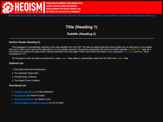
figured out how to do a vertical split with a flexbox; special thanks to https://lupinus.neocities.org/ whose code i kept having to reference back and forth between a medium guide at https://tinyurl.com/medium-flexbox
2 likes
2 likes
i sometimes worry that i use a bit of purple prose instead of eloquent language that's actually in service of the things i write. might do some rewriting of some existing stuff soon, just exhausted atm (working a 7 day week. i sincerely wish i was being facetious.)
1 like
 donovan-thought
9 months ago
basically i want to humanize things more because im subconsciously making it fancier than it needs to be
1 like
1 like
 donovan-thought
9 months ago
i cannot for the life of me find a single tutorial on image size restriction inside of a div without manually adjusting it
1 like
 donovan-thought
9 months ago
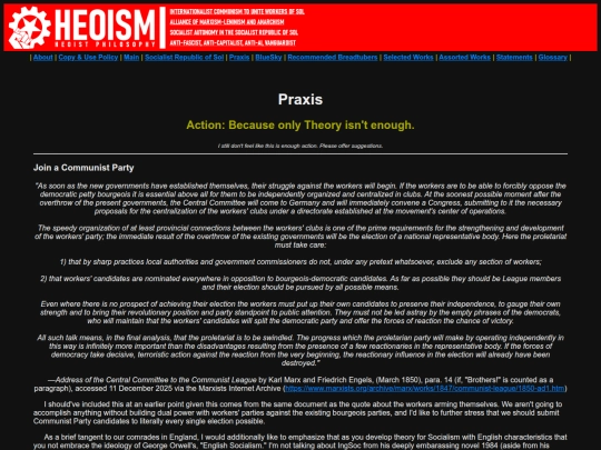
amid the editing chaos, the new page that was added was this: https://heoism.neocities.org/praxis
i keep seeing this account called "ughbees" liking comments on foggybear42's site and every single time the pokemon "fuck bees" song pops in my head
1 like
1 like
welcome to neocities comrade; best of luck with the site development!
3 likes

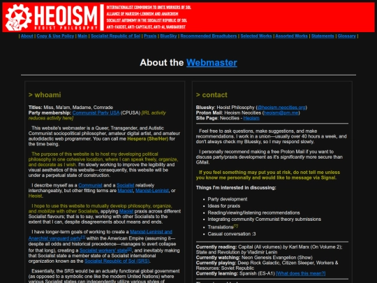
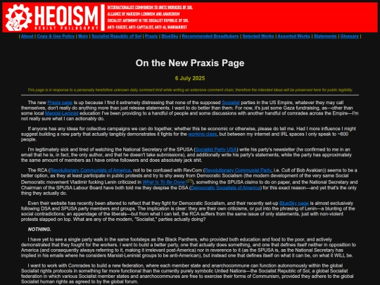
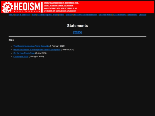
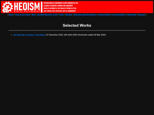
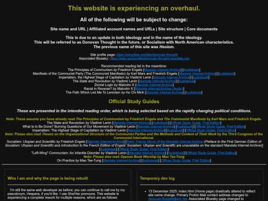


i mean i absolutely don't mind the increased reach (even if small) but it's a little silly that google.. google bombed itself?