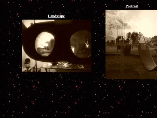
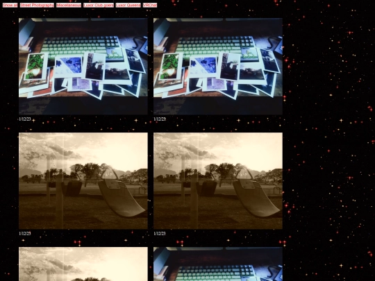
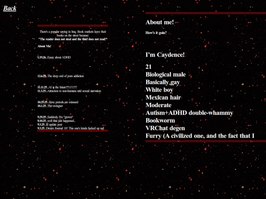
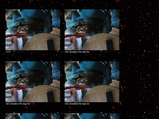
FYI, my sites overlay is undergoing a big overhaul atm. I decided that the last look was too visually noisy not just for my personal taste but also because I feel like it no longer really matches who I am atm. I've always considered my blog the main focus of caydence.net, but from now on I'll be portraying a UI that properly visually communicates that. Continued in comments
I'm removing lots of little things that in hindsight I only really put there to fill space. My old philosophy was to fill as much space as possible, but from now on I'm going to try and embrace it for the sake of visual simplicity. I really like the new background I'm using, much easier on the eyes I think!
Hiiii!! I just posted a lil review I guess you could call it?? Of a book I really enjoyed, The Lighthouse Keeper's Daughter. Check it out if you'd be interested!!
I'm removing lots of little things that in hindsight I only really put there to fill space. My old philosophy was to fill as much space as possible, but from now on I'm going to try and embrace it for the sake of visual simplicity. I really like the new background I'm using, much easier on the eyes I think!
It already looks a lot better!